How to create an interactive trending line chart that tracks two data series
Summary
Before you begin, read Preparing to create and use interactive charts.
Figure 1 is an example of trending line chart that plots two data series over the past week: the number of work objects that were created and the number of work objects that were resolved.
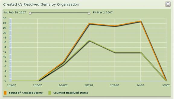
Figure 1. Example two-trend chart: Created vs. Resolved Items by Organization
Suggested Approach
To create a report like the one shown in Figure 1, complete the following steps:
1. Run the Report Wizard to create the report. We specified that the organization should be equal to the user's organization as the report criteria, grouped the data by organization, and set up trends for two fields:
- pxCreateDateTime. Figure 2 shows an example.
- pyResolvedTimeStamp. Figure 3 shows an example.
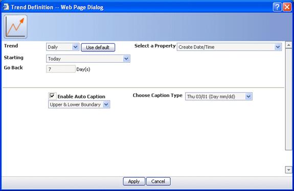
Figure 2. Trend Definition window for Create Date/Time property
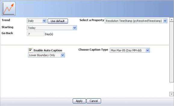
Figure 3. Trend definition for pyResolvedTimeStamp field
2. In the Charts form of the Wizard, select the chart option and click Configure Interactive Charts.
3. From the Type tab, select Line and Segment (Figure 4).
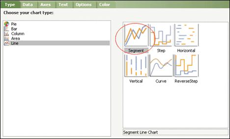
Figure 4. Type tab for example two trend chart
4. On the Data tab, specify that the series plotted on the Y axis should be the calendar dates by selecting the Swap Series/Groups option. Also, ensure that all options in the Category and Data Axis sections are selected. Keep Limit to Top set to No Limit. (Figure 5)
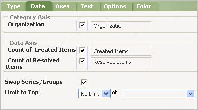
Figure 5. Data tab for example two trend chart
5. On the Axes tab, configure the group axis to appear on the bottom and the data axis to line up on the left. Specify that the Axis Scale should be Date Time (Figure 6).

Figure 6. Axes tab for example two trend chart
6. On the Text tab, enter a title for the chart (Figure 7).
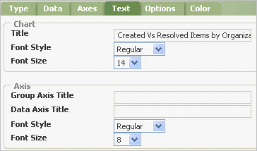
Figure 7. Text tab for example two trend chart
7. On the Options tab, set the Series Effect to Interpolate, configure a legend to appear at the bottom, and select the Slider option (Figure 8).
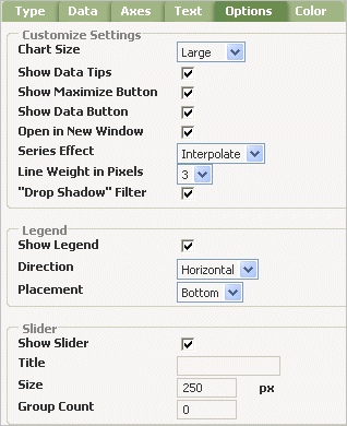
Figure 8. Options tab for example two trend chart
8. For this report, set the background color to a light green. For your reports, you are likely to iterate through color selections more than once. Start by accepting the defaults, and then preview the report to see if you like them. If you don't like the results, try various color combinations until you are satisfied. If you select more than one background color, the background color appears as a linear gradient of those colors.
9. Click Apply to save your settings and continue with the Report Wizard forms to preview the chart. Click Back to return to the Chart form if you want to change your settings.
See Also
See also the following articles: