How to use the UI Tree tool
The UI Tree tool helps you to understand the structure of the currently displayed page at runtime and in Designer Studio. Once activated, a sidebar column is displayed listing a tree of all artifacts on the current page. You can navigate through Pega artifacts on the page using either the tree representation or by directly hovering over the artifact on the page itself. Once an artifact is selected either on the tree or on the page, you can:
- Display detailed information about the selected Pega artifact, and if desired, open the rule automatically in Designer Studio.
- Inspect detailed setup for the element by opening its property panel directly from within the runtime UI in read only mode.
- Copy items to the scratch pad for use in reporting.
Using the UI Tree tool
This article discusses general usage of the UI Tree tool.
- Enabling the UI Tree
- Launching the UI Tree tool
- Selecting an element
- Interacting with an element
- Page navigation when using the UI Tree tool
Enabling the UI Tree
Two standard, out-of-the-box developer roles, PegaRULES:SysAdm4 and PegaRULES:SysArch4, include the privilege for the UI Tree. To enable the UI Tree for other roles, create a role that has access to the pxUIInspector privilege. Refresh your Pega 7 session after associating the role with your operator.
Launching the UI Tree tool
Open the UI Tree tool by clicking the UI Tree button at the bottom of the screen.
- In Designer Studio, this button is available in the footer toolbar:

- At runtime, this is available at the bottom of the screen if you have the correct user privileges:
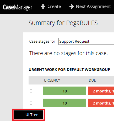
When active, the text in the UI Tree button is highlighted in blue:

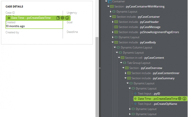
Activating the UI Tree tool displays a sidebar column with a fully expanded hierarchical list of all artifacts on the current page. Clicking any of the items collapses the list to show only the hierarchy specific to the selected element.
| Default display | Collapsed display |
|---|---|
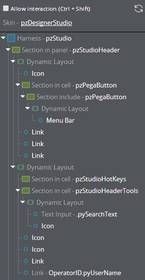 |  |
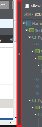
You can adjust the width of the sidebar by dragging its edge with your cursor. The width remains consistent even if the UI Tree is closed then reopened.
Selecting an element
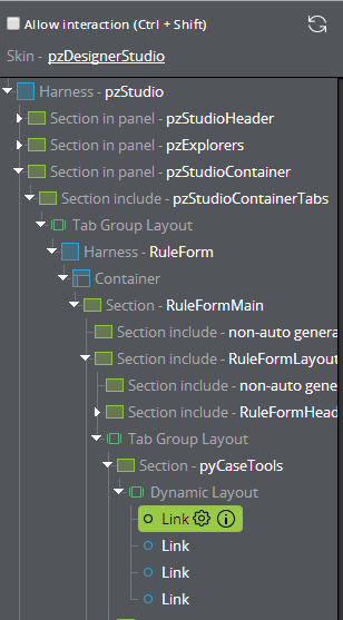
To select an element, move your cursor over any of the items on the page or in the sidebar, which highlights the artifact in blue in both locations:
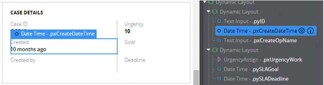
Click either the item on the page or the name in the sidebar list to change the highlight from blue to green:
Only one element can be selected at a time, and the selected item remains highlighted in in green until you select a new element, refresh the sidebar, or turn the UI Tree tool off.
To refresh the sidebar, click the refresh icon at the top of the sidebar to clear the selected element and redisplay the default expanded hierarchical list.

Interacting with an element
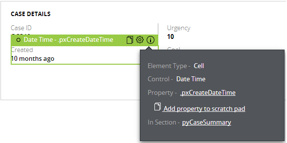
Once an element has been selected, several icons are displayed next to the element's name, depending on its type. Below is an example of an element with all available options:
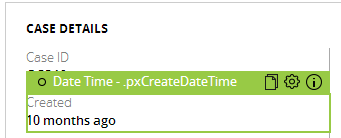
These options also are displayed when selecting the item from the sidebar list. These options allow you to do the following:
Sheets of paper icon - adds the property to the scratch pad
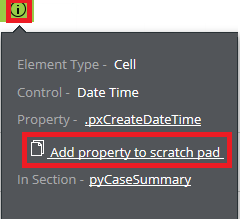
- You can also add a property to the scratchpad from the Info icon popup menu if applicable by clicking the "Add property to scratch pad" link.
- This icon does not appear next to an element's name in the sidebar, but can still be selected from the Info icon popup menu in the sidebar if applicable.

- You can also add a property to the scratchpad from the Info icon popup menu if applicable by clicking the "Add property to scratch pad" link.
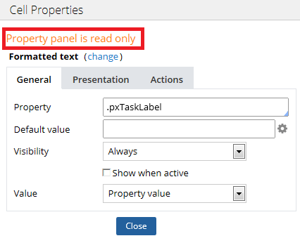
- Gear icon - opens the Cell Properties window for the element in read only mode, indicated by a message at the top of the window:
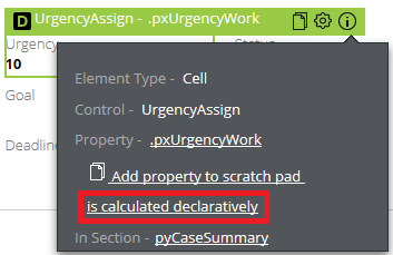
- Info icon - displays information about the element in a popup menu, similar to what is shown when using the UI Inspector tool:
Declarative properties
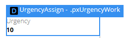
Declarative items are listed with a "D" next to the element's name.
- In the sidebar, a pink D is displayed:

- In the main window, a black D is displayed:
Clicking the "is calculated declaratively" link on the Info icon popup menu opens the declarative network display, but ONLY when accessed using Internet Explorer.
Page navigation when using the UI Tree tool
When the UI Tree tool is active, you can still navigate to a different page without turning the tool off. Check the Allow interaction check box or press Ctrl + Shift on your keyboard to regain access to page navigation.
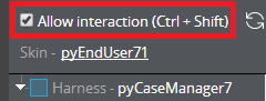
Uncheck this check box to reactivate UI Tree tool functionality.