Key portal layouts
The portals in the SCE have a common layout, but the functions available are restricted based on the portal being utilized and the roles associated with the user. The portals use the dynamic layout model that will restructure the UX based on the size of the screen being utilized. Hot key and tabs are enabled on all the UX screens. Specific information surrounding the use of hotkeys are detailed later in this section.
The top ribbon contains the Pega logo, the name of the application, any tabs that are open, the “Get next” action and access to the user profile.
| Item | Action |
 | Clicking on the Pega logo will take the display back to the dashboard |
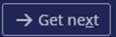 | Clicking on the Get next icon will retrieve the highest priority work item available to you |
 | Clicking on the user icon will provide access to any user configurations, availability and other system features that are available to you |
The left panel provides access to all the features in the SCE that are enabled for the user. If there are multiple sub features available, they can be displayed by selecting the > icon. On a smaller browser screen, only the icons will be displayed. Hovering over the icons will expand the panel to show the names and any sub menu items. The list of standard items on each portal is detailed in the section covering Portals and Personas.
Under the user features menu, the most recent work items for that user are listed. If there are many recent items in the user’s profile, the See all link will appear. Selecting this will open a tab detailing the full list of recently opened items.
An example screen shot of the left panel is shown below:

Middle pane – the middle pane is the primary work area and displays the information on each tab that is opened. The primary tab, the dashboard, is displayed on initial login provides links to your To Do List along with other items that have been configured as part of your standard dashboard. The following list details the standard widgets that are available on some of the dashboards (note that the OOTB portals may not include all of them):
- To Do List - Includes work items selected through get next, or other work assigned to you. This list is organized by urgency and ID.
- Recents – Includes items that have recently been opened or worked by you.
- Following – Includes items that you have selected to follow.
- Team Members – Includes a list of your team members and the number of items in their worklist.
- Notifications – Includes the list of active configured system notifications.
Each work item opened in the portal creates a new tab in the middle pane. The list of current tabs can also be accessed by the caret (6) on the top pane.
Previous topic UX navigation models Next topic Claims information