|
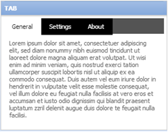
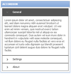
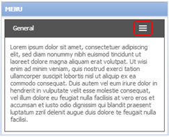
A layout group is a way to present information responsively that is normally shown within one control type. A layout group can be rendered as a tab control, an accordion, stacked format, or a dropdown-style menu according to screen size. A layout group can contain any number of dynamic layouts, column layouts, repeating dynamic layouts, or other layout groups.
With a layout group, what would usually appear as a tab control on a regular desktop or laptop converts to a different navigation mechanism on a mobile device, negating the need for horizontal scrolling. You can set responsive breakpoints, enabling the layout to adjust to the available space. When the user resizes to the default or custom breakpoint dimensions, tabs turn into an accordion or a menu.
![]() Layout groups are available only to user interfaces rendered in HTML5 Document Type (standards mode). Layout groups have been designed to comply fully with WCAG accessibility guidelines.
Layout groups are available only to user interfaces rendered in HTML5 Document Type (standards mode). Layout groups have been designed to comply fully with WCAG accessibility guidelines.
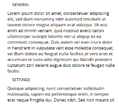
There are four style formats for layout groups:


Stacked
Panes are selectable by a stacked format.

A preview of the currently selected format displays to the right. You can also preview formats by selecting Actions > Launch in the toolbar and then choosing one of the following preview options: Run Process, Open Portal, Harness Preview, UI Gallery Preview, Skin Preview.
 and drag and drop
 to open the layout group properties panel.
To view and interact with examples and review configurations, select  > User Interface > UI Gallery and then select Layout Group in the Layouts and Containers group. Not implemented yet.

|
Layout group
|

|