About the Data Visualizer |
The Data Visualizer gives you a visual depiction of the relationships between the selected data type and its properties, and with the other data types in the application.You can use the Data Visualizer to explore and extend the data map for your data type.
Adjust the display using the four buttons at the top right:
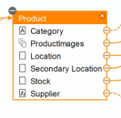
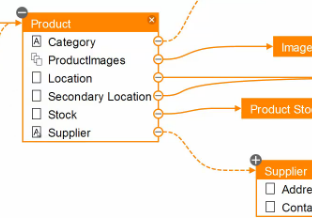
Every node in the diagram represents a PRPC class, or a data type (which is, in fact a class). Every entry within the node represents a page or a page-list property of that class:

The properties can have one of three icons:
The lines that join properties can be solid or dotted. A dotted line indicates that a dynamic reference is established between the properties the line connects.

A + icon at the top left of a node, as with the "Supplier" node in the image above, indicates that there are additional incoming relationships for that node. Click the icon to display those relationships. A - (minus) icon indicates all relationships for that node are visible. Click the icon to hide the relationships.
When you hover over a node in the display, the other nodes with which it is connected turn orange to help you visualize the selected node's relationships.
The Data Visualizer displays related case types with a darker header and a case type icon:
To edit a second node, as well as the one from which you launched the Data Visualizer, double-click on it. The data type or class type opens in its own tab, and you can edit it there. In that tab, you can click the Visualize button to generate a second Data Visualizer display centered on the second node.
To edit the original node, select the top edge of the Data Visualizer and drag it down to reveal the data type you started with:

You can make edits in the Data Designer view and review their impact in the Data Visualizer.