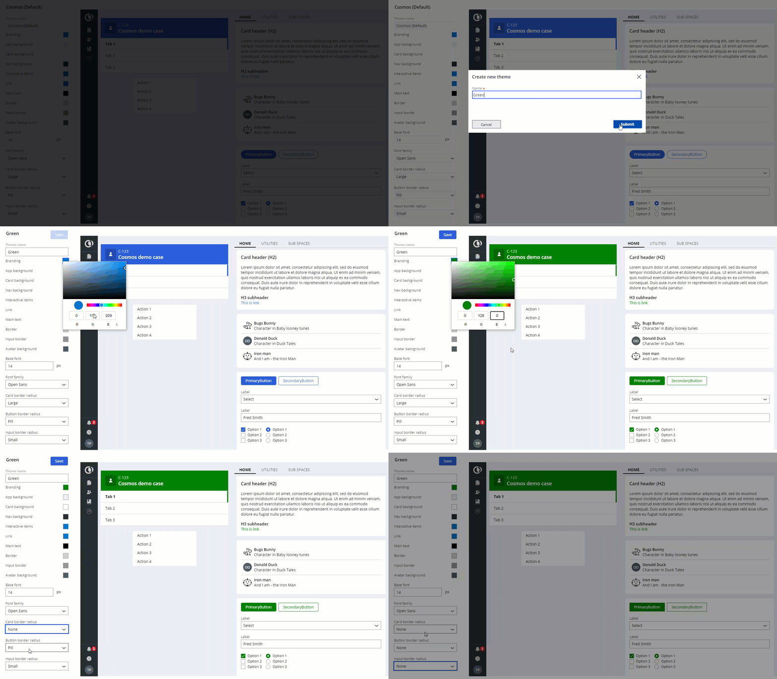
Branding your application
Design systems help you introduce consistency to the applications that you build. By choosing to use a design system, you can scale your designs to maintain a unified presence across a number of platforms with less effort.
A design system is a library of patterns and rules that determine how an interface responds to user interaction. Design systems contain the best practice guidelines, operational assets, and UI components that are required to deliver the interface. For example, a design system might include a reusable table component that supports sorting, filtering, and grouping. You can source every table in your application from that component, which means that every table in the application can have the same basic architecture and rely on consistent rules to model user interactions.
Some organizations develop proprietary design systems to unify the presentation, behavior, and structural rules of their application interfaces. However, most businesses rely on the design system that is provided by Pega. Either approach helps improve consistency, and creates a system that is easier to update and maintain.
Cosmos design system
Pega Platform uses the Pega Cosmos design system as its main product design resource. The system provides a consistent library of components that form the entire user experience for both customer-facing applications andPega Platform itself.
Cosmos relies fully on templates and prefabricated components for more efficient development and performance. In addition, a more modern design and increased focus on intuitiveness help save time on application updates and user training.
Depending on the architecture that you use, the Cosmos design system has two versions: Cosmos React, which serves the view-based architecture, and Theme Cosmos, which relies on sections.
When creating a new application, you can choose between a view-based Cosmos React UI, or a section-based Theme Cosmos UI, which can be further expanded to include hybrid React components.
Cosmos supports a number of JavaScript libraries, including React UI, which is the framework on which Pega Platform bases its UI components. For more information, see Accelerate your workflow with Cosmos UI.

Discover more about styling your application in the following articles:
- Defining themes
Ensure that your applications meet the branding requirements of your business by configuring the graphic design of your portal. By setting a distinct color palette for UI elements such as buttons, links, or headers, you can create a consistent visual identity.
- Adding custom fonts to a Cosmos React theme
Ensure that the UI meets the branding requirements of your business by adding custom fonts to your application. In Cosmos React, you can add a font by referencing an external URL source or by uploading a binary file with the font to Pega Platform.
- Design tokens
UI components in Cosmos React use design tokens, which are a tool that helps you store the visual attributes of your application as discrete options. By using a design token, you can unify style elements across different channels, tools, and applications.
Previous topic Configuring cascading drop-down lists Next topic Defining themes
