User Interface: What's New in Pega 7
 | Design and build responsive and contemporary user experiences using new dynamic screen layouts and the latest in web technology. Ensure consistency and promote reuse with new application skinning capabilities. |
Increase productivity using simplified UI authoring tools.
Develop intuitive UI with ease and speedImproved usability and consistency throughout the design-time experience make it easier than ever to build your UI — and your Pega expertise. Define UI elements, set presentation, and configure events and actions using re-designed and simplified property panels. Take advantage of Pega 7's rich library of controls, events, and actions and use the automatic upgrade feature to update your application to leverage the most current controls. | 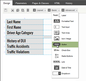 |
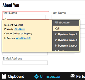 | Explore UI building blocks using the UI InspectorUnderstand the hierarchy of elements that comprise your UI and make changes easily using the new UI Inspector. This powerful tool enables you to hover over areas in the UI, identify the building blocks, and open the relevant UI elements — directly from the UI Inspector. |
Ensure consistency and promote reuse with powerful new capabilities in the skin.
Enable consistency across portalsYou can style all presentation elements of your interface in the skin, including typography, borders, backgrounds, layouts, and UI placement and alignment. By defining presentation attributes in the skin, you can now separate content from its presentation, ensuring greater consistency and promoting reuse. Pega 7 makes it easy to define a single skin for your entire application, ensuring that all portals are presented in the most consistent manner. |  |
 | Evolve your brand efficiently using extensible skin formatsExtensible skin formats enable you to define multiple styling variations for components defined within the skin. Granular control of styles and CSS extension points eliminate inline styles and custom CSS files. Multiple formats ensure that you can manage branding and styling entirely in the skin and enable you to separate content from presentation. |
Increase reuse with cascading mixinsSimplify your skin by defining common styling elements as mixins. You can reuse mixins in other mixins and component styles. Mixins enable you to create incremental styling changes which provide a natural cascading of styles. Using mixins, you can easily and efficiently make consistent modifications to your UI styling. | 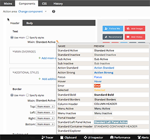 |
Develop responsive, contemporary UI using the latest web standards.
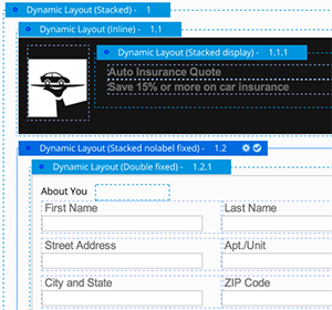
 | Build UI that is contemporary in navigation, structure, and style using web standards, including HTML5 and CSS3. New applications built in Pega 7 take advantage of the latest features available in today's modern web browsers. Upgrading an application to take advantage of these new capabilities is easy using the HTML5 readiness tools and auto-upgrade facilities. A new set of standards-based layouts enable you to set responsive breakpoints and achieve responsive behaviors that automatically adjust the layout based on screen size and/or device type. |