Working with charts in reports (6.3)
Adding a chart to a report can make it easier for report users to understand and act on the information the report contains. A chart can show in a dramatic fashion the changes of values over time (sales per division per quarter), the relative significance of similar elements (revenue generated by each product in the product line), or potential issues in the lifecycle of a work item (average days spent in each stage of the process).
Charts associated with PRPC Report Definition reports can let the report reader:
- zoom in or out along a timeline or a trend report, to show the big picture or a critical section of the chart
- change the filter conditions for the report, perhaps to show only the top-perfoming (or worst performing!) products
- switch between a 2-D and a 3-D display of the chart
- click on a section of a chart to drill down to the report values that support it
Report Definitions generate list-type and summary-type reports. Only summary-type reports support charts. A summary-type report has at least one column with an aggregate value (the sum of..., the average of...) and at least one group-by column (work item ID, ID of the operator resolving the work item, create date, and so on).
Chart Editor access
The Chart Editor gives you the controls to create and edit charts for summary-type reports. To access the Chart Editor
- Access the Report Browser. The Report Browser appears in different places in different portals. For example, in the Designer Studio it is available by clicking the Pega button, then selecting Reporting > Access > Report Browser; in the Case Manager portal, the Report Browser appears in the My Reports tab. (In the Designer Studio you can also select the Report Definition rule for the report you want to work with, and launch the Chart Editor through the Chart tab.)
 Select a summary-type report or create a new one. An existing report appears in the Report Viewer. Unless editing is disabled for this report, click the editor icon in the toolbar at the top to open the report in the Report Editor. A new report appears in the Report Editor right away.
 Click the chart icon in the toolbar to open the Chart Editor for this report:
See the discussion below to understand the features of the Chart Editor.
Available chart types
In PRPC 6.3, you can choose from seven chart types, each with several subtypes:
| Chart type | Subtype |
|---|---|
Pie |
|
Bar |
|
Column |
|
Line |
|
Area |
|
Pyramid |
|
Funnel |
|
Suggested Approach
This section demonstrates how to create a new report, add a chart to it, and modify the chart. This gives you the basis for investigating the Chart Editor and the many settings that can help you create a chart that clearly presents its report's data.
- Open the Report Browser as described above. Make sure you have at least one personal category.
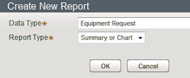 Click the New Report button. Create a new report for a Data Type where you know there is data to report on. In this example, the new report is for the Equipment Request class of a corporate onboarding application to process newly-hired staff. For Report Type, select Summary or Chart.
- When you create a new report, the Report Browser uses a default template to populate the report. For the report on equipment requests, the default report shows information about unresolved work items that were created in the past seven days:
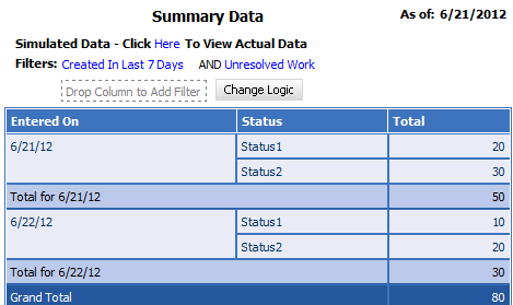
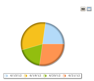
The original display is of simulated data, which loads quickly. Click the provided link to use actual data instead: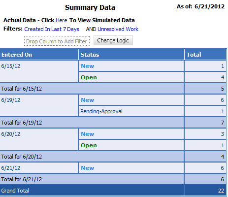
The report is sort of interesting, but your manager wants something with more impact--like a chart! - Click the chart icon in the toolbar, as described above. The Chart Editor appears:
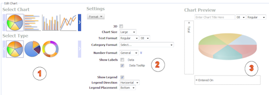
The Chart Editor has three main sections, with the chart's report below it:- Select - In the left section, select a chart type and subtype from the options described above.
- Settings - The fields that appear in the middle section relate to the type of chart you selected. Notethe button-shaped menu at the top of the section: select in turn each of the three displays available to see and work with important controls that help refine your chart:
- Format: The fields in this section let you set whether the chart appears in both 2-D and 3_D options, and the formatting of text, labels, and legends.
- Data: The fields here relate to the amount of data the chart supports. For example, for a pie chart the Limit To Top field sets the maximum number of pie slices the chart displays.
- Options: The fields in this section control, for instance, whether a "maximize" button appears so the user can display a larger copy of the chart in a separate window. For line, bar, column, and area charts, controls appear here for customizing the chart slider, the tool that lets the user zoom in to a particular segment of the chart, or zoom out for a high-level view.
- Chart Preview- The title of this section is a little misleading. While indeed there is a preview of the chart type and subtype you selected, the section also has important controls.
- At the top of the section you can enter and format a title for the chart.
- Depending on the chart type, two or more dotted rectangles appear near or over the chart type preview. These rectangles are targets: you can drag report columns, or properties or calculations from the Data Explorer, and drop them on the targets to tell the chart what properties to use for, say, the X and Y axes or the lines in a line chart.
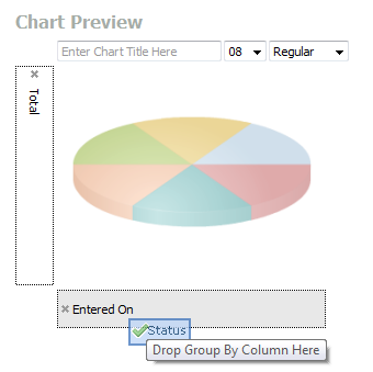
- When you open the Chart Editor for a new report, by default it displays a chart using a best-guess of columns from the report. In the case of the onboarding report, the report groups the data by the day the work items were created, so the report also displays them grouped by create date:
This seems to you to satisfy the "eye-catching" requirement, but your manager looks at it and says, "This is all wrong! I want to see the non-resolved work items grouped by status, not by date." Fortunately, the Chart Editor is on your side. - Open the Chart Editor for the report again, select the "Status" column header in the report, and drag it over the target rectangle holding the "Entered on" value:
Now when you click Apply, the report displays the data in the way your manager wants: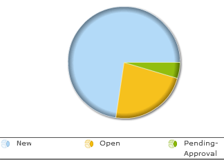
- Select - In the left section, select a chart type and subtype from the options described above.
You can experiment endlessly, changing chart types, adding columns to the chart and taking other columns out, until you find the combination of data and display that most clearly projects for its intended audience the information the report holds.