
Swipe action added for mobile navigation of layout groups
Valid from Pega Version 7.1.7
You can now swipe to navigate across available content in the tabbed or menu-style layout groups by simply enabling swipe on the layout group property panel.
With this setting, visible indicators appear on the left and/or right when there is additional content to view. The swipe indicators display when a user taps down on their touch device and disappears when the user taps up (lifts) from the screen or moves to another area. Additionally, you can use custom CSS to change the fade-in and fade-out behaviors of the swipe indicators.
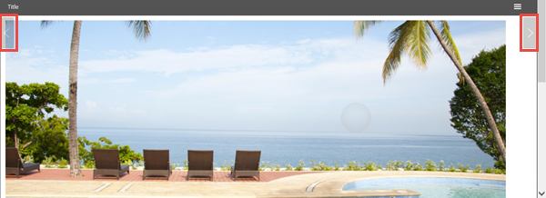
Left and right swipe indicators in a layout group
For example, when you display a tabbed representation on a desktop that switches to a menu format at a breakpoint, the mobile user no longer has to select a menu option by touching the header to disclose the available menu item. Instead, the mobile user can simply swipe the content and navigate to either the next or previous layout and the menu updates to the current selected layout.
Actionable layouts improve mobile experience
Valid from Pega Version 7.1.7
Interactive layouts are now easier to use from a mobile device. With the added ability to specify events and actions on dynamic layouts rather than on individual items, you can deliver enhanced user interface interaction from a mobile device. For example, you can configure interaction with an entire tile rather than individual elements of the tile for easier tapping.
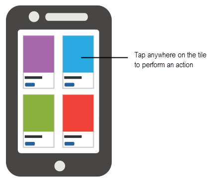
Configure an entire tile for easier interaction from a mobile device
From the Actions tab of the Dynamic layout properties panel, you can define an action set and then add events and actions. Actions on nested layouts or controls take precedence when acted upon.
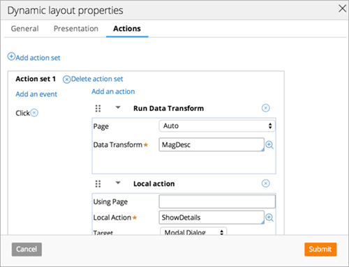
Specify events and actions from the Actions tab of the properties panel
Update to UI-Kit-7:02-01-01 for latest features and mobile-ready Case Worker portal
Valid from Pega Version 7.1.7
The UI Kit ruleset (UI-Kit-7:02-01-01) contains the latest rules and a skin (pyEndUser71) for use in building or customizing Pega 7 user interfaces. Updating to this version allows you to take advantage of the newest features and styling, including a new responsive Case Worker portal.
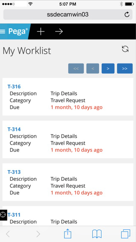
Mobile view of the Case Worker portal
Like the Case Manager portal, the Case Worker portal is mobile-ready and provides case workers with a standard user interface for:
- Displaying a worklist of all open cases
- Viewing information about cases associated with case types defined in the Case Explorer
- Displaying a calendar view of work assignments
- Updating the user's profile
For more information, see Using the UI Kit ruleset.
Replacement for window.showModalDialog
Valid from Pega Version 7.1.7
With Google Chrome disabling showModalDialog in Chrome 37, it is recommended to upgrade your application to use auto-generated local actions. To make it easy to identify where showModalDialog is used in your application, an alert window displays when the window.showModalDialog API is used in your application.
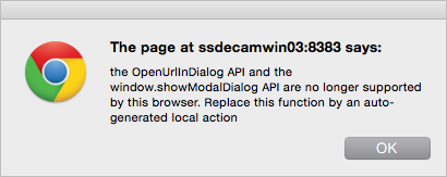
An alert window provides better feedback than a JavaScript exception.
Offline capability in mobile applications
Valid from Pega Version 7.1.7
With Pega 7, mobile applications (apps) can be built with the offline capability enabled. Enabling the offline capability for an app means that a user can create a new case or complete any assignments from their worklist. Changes performed offline are automatically synchronized when the mobile app comes back online.
For more information, see Mobile offline capability.
Auto-complete functionality optimized for mobile applications
Valid from Pega Version 7.1.7
When typing within a field in a mobile application, once a specified minimum number of search characters is entered, auto-complete functionality (pxAutoComplete) populates the entire screen with a list of suggestions. Tap an item in the list to select it for the specified field, or continue typing to ignore the suggestions.
This feature is only available for mobile applications running in Pega 7.1.7. Any previously created applications can utilize this auto-complete functionality if they are upgraded to run in Pega 7.1.7.
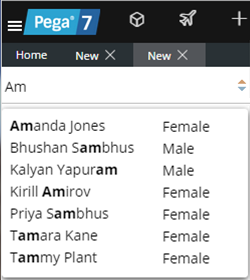
Start typing and auto-complete displays a list of suggested results
Grid cascading filtering
Valid from Pega Version 7.1.8
At run time, filtering a grid by column yields accurate results as filter criteria cascade down when filtering by column heading. The filter panel displays only those values that apply based on other filter criteria. Values are filtered on both value and range.
Internet Application Composer mashup code generation
Valid from Pega Version 7.1.8
Case types can be added to an external web page by using the mashup code created in Case Designer. The mashup code is custom HTML that can be added to Internet Application Composer (IAC) codes.
The Actions menu in Case Designer includes the ability to automatically generate IAC HTML from a case type. The HTML is then copied and pasted into the target web page through standard IAC options.
The generated code is optimized for responsive web sites and responsive Pega applications. See Generating a mashup code in case configuration.
Edit application elements at run time by using Live UI
Valid from Pega Version 7.1.8
Live UI supports the addition, deletion, or reordering of UI elements within the run-time portal. Move elements by dragging and dropping within the tree. Elements can be added, deleted, and moved within or between dynamic layouts at run time by using Live UI.
Full-screen menus improve mobile navigation
Valid from Pega Version 7.1.8
A new full-screen menu setting for enhanced mobile functionality provides a smooth and seamless mobile navigation experience. Previously, regular drop-down menus were difficult to navigate on a mobile device. Select Component styles > Menus > Menu Bar > Display "Show Menu" as full screen menu to enable and configure this setting in a Skin form.