
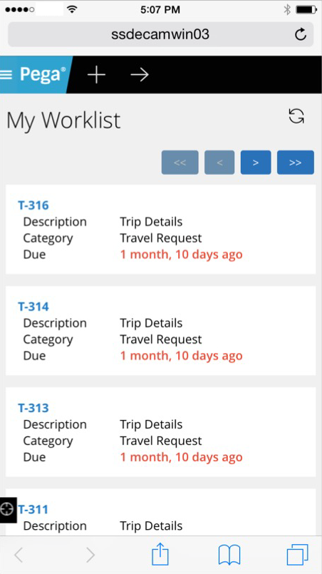
Live UI enables runtime editing for less technical users, replaces UI Inspector and UI Tree
Valid from Pega Version 7.1.7
The previous UI Tree and UI Inspector tools have been replaced by the newly enhanced Live UI tool. Offering true WYSIWYG editing, less technical users can make UI adjustments at runtime and publish or discard changes on the fly through automated rule management using a new runtime branch governance model.
With Live UI, you can:
- Publish and discard records as a batch or individually.
- Display detailed information about Pega artifacts and open rules automatically at runtime.
- Inspect detailed setup for an element by opening its properties panel and then edit directly from within the UI (if enabled).
- Undo the last change you made in the tool.
- Copy items to the scratch pad for use in reporting.
- Display a breadcrumb trail that lists immediate ancestors.
You can make on-the-fly changes at runtime by clicking the gear icon to edit the properties panel.
Live UI is not supported in Internet Explorer 8. Internet Explorer 8 users will see the older UI Inspector tool in Designer Studio.
For more information, see How to use the Live UI tool.
Swipe action added for mobile navigation of layout groups
Valid from Pega Version 7.1.7
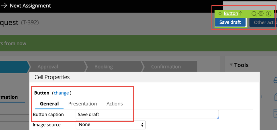
You can now swipe to navigate across available content in the tabbed or menu-style layout groups by simply enabling swipe on the layout group property panel.
With this setting, visible indicators appear on the left and/or right when there is additional content to view. The swipe indicators display when a user taps down on their touch device and disappears when the user taps up (lifts) from the screen or moves to another area. Additionally, you can use custom CSS to change the fade-in and fade-out behaviors of the swipe indicators.
Left and right swipe indicators in a layout group
For example, when you display a tabbed representation on a desktop that switches to a menu format at a breakpoint, the mobile user no longer has to select a menu option by touching the header to disclose the available menu item. Instead, the mobile user can simply swipe the content and navigate to either the next or previous layout and the menu updates to the current selected layout.
Actionable layouts improve mobile experience
Valid from Pega Version 7.1.7
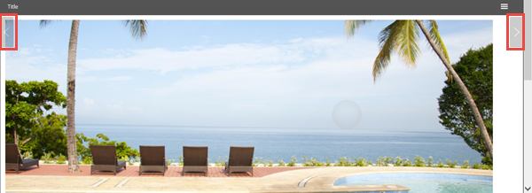
Interactive layouts are now easier to use from a mobile device. With the added ability to specify events and actions on dynamic layouts rather than on individual items, you can deliver enhanced user interface interaction from a mobile device. For example, you can configure interaction with an entire tile rather than individual elements of the tile for easier tapping.
Configure an entire tile for easier interaction from a mobile device
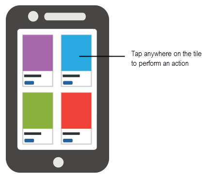
From the Actions tab of the Dynamic layout properties panel, you can define an action set and then add events and actions. Actions on nested layouts or controls take precedence when acted upon.
Specify events and actions from the Actions tab of the properties panel
Update to UI-Kit-7:02-01-01 for latest features and mobile-ready Case Worker portal
Valid from Pega Version 7.1.7
The UI Kit ruleset (UI-Kit-7:02-01-01) contains the latest rules and a skin (pyEndUser71) for use in building or customizing Pega 7 user interfaces. Updating to this version allows you to take advantage of the newest features and styling, including a new responsive Case Worker portal.
Mobile view of the Case Worker portal
Like the Case Manager portal, the Case Worker portal is mobile-ready and provides case workers with a standard user interface for:
- Displaying a worklist of all open cases
- Viewing information about cases associated with case types defined in the Case Explorer
- Displaying a calendar view of work assignments
- Updating the user's profile
For more information, see Using the UI Kit ruleset.
Replacement for window.showModalDialog
Valid from Pega Version 7.1.7
With Google Chrome disabling showModalDialog in Chrome 37, it is recommended to upgrade your application to use auto-generated local actions. To make it easy to identify where showModalDialog is used in your application, an alert window displays when the window.showModalDialog API is used in your application.
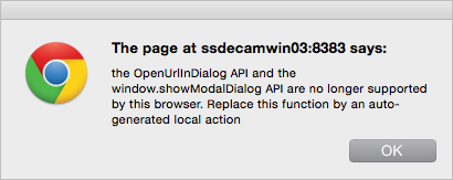
An alert window provides better feedback than a JavaScript exception.
Offline capability in mobile applications
Valid from Pega Version 7.1.7
With Pega 7, mobile applications (apps) can be built with the offline capability enabled. Enabling the offline capability for an app means that a user can create a new case or complete any assignments from their worklist. Changes performed offline are automatically synchronized when the mobile app comes back online.
For more information, see Mobile offline capability.
Auto-complete functionality optimized for mobile applications
Valid from Pega Version 7.1.7
When typing within a field in a mobile application, once a specified minimum number of search characters is entered, auto-complete functionality (pxAutoComplete) populates the entire screen with a list of suggestions. Tap an item in the list to select it for the specified field, or continue typing to ignore the suggestions.
This feature is only available for mobile applications running in Pega 7.1.7. Any previously created applications can utilize this auto-complete functionality if they are upgraded to run in Pega 7.1.7.
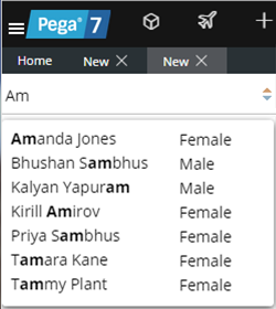
Start typing and auto-complete displays a list of suggested results
The most current version of the engine code is used by default
Valid from Pega Version 7.1.7
Beginning in Pega 7.1.7, the "com.pega.pegarules.bootstrap.codeset.version.Pega-EngineCode" setting is removed from the prbootstrap.properties file. By default, Pega 7.1.7 uses the most current version of the code present in the system.
Improved cross-browser support
Valid from Pega Version 7.1.7
All rule forms are now harness-based and open in the work area of Designer Studio. This means that you can develop in the browser of your choice, free from pop-up distractions and incompatibility messages. Many rule forms have been upgraded to use the latest layouts, styles, and design best practices, giving you a consistent development experience.

Viewing a Word Template in Pega 7.1.7 compared with Pega 7.1.6
Previous restrictions still apply to any deprecated or custom rule forms in your application that remain form-based. Refer to the Deprecated features list for guidance on how to upgrade these forms and recommended alternatives.
Changes to archive.info in Pega 7.1.7
Valid from Pega Version 7.1.7
In Pega 7.1.7, the contents of the archive.info file have changed.
- In versions Pega 7.1.6 and earlier, the archive.info file displays the build number of the Pega installation.
- As of Pega 7.1.7, the build number no longer appears in the archive.info file.
In Pega 7.1.7, the archive.info file only displays a status message indicating whether or not the system is running, and the build number no longer appears. Instead, if the system is operational, the message “status=Running” displays in the archive.info file.
If there are any automated tests, scripts, or applications that rely on the archive.info file displaying the build number, those may fail and produce an error. It is recommended that any automation that relies on the build number displaying in the archive.info file be changed to look for the “status=Running” message.