
Link configuration in grid columns
Valid from Pega Version 7.1.5
Grid columns now support configuring a link with either simple text (or field value) or with a property reference.
To configure a link, in Designer Studio, add a link control to a section from the Basic control group. Click the gear icon in the link control to open the Cell Properties dialog. In the Link caption field, select either Field Value, Parameter, Text, or Property Reference.
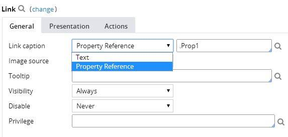
For each selection:
- Field value displays a field value picker
- Parameter displays the list of parameters associated with the section in a dropdown
- Text displays a text input
- Property Reference displays a property picker
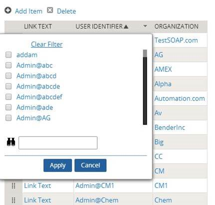
Selecting Property Reference allows grid columns to be sorted and filtered, as shown below:
Attach Content control
Valid from Pega Version 7.1.5
The Attach Content control assists with attaching and uploading media files for Pega 7 applications. When in a mobile web browser, this control is limited to attaching image files only. Using a desktop browser with this control enabled launches the file browser, allowing users to select a type of capture mechanism and/or utilize an "attach file(s)" file selection prompt directly from their desktop.
Display dropdown lists in descending order
Valid from Pega Version 7.1.5
The dropdown grouping feature now allows you to display a list of groups in both "Ascending order" and "Descending order". Previously, only Ascending order was available.
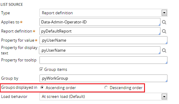
This feature is available on the General tab of the Cell Properties dialog in Designer Studio.
Create PDF Smart Shape supports orientation
Valid from Pega Version 7.1.5
The Create PDF Smart Shape contains settings that allow you to orient the PDF in a profile or landscape layout.
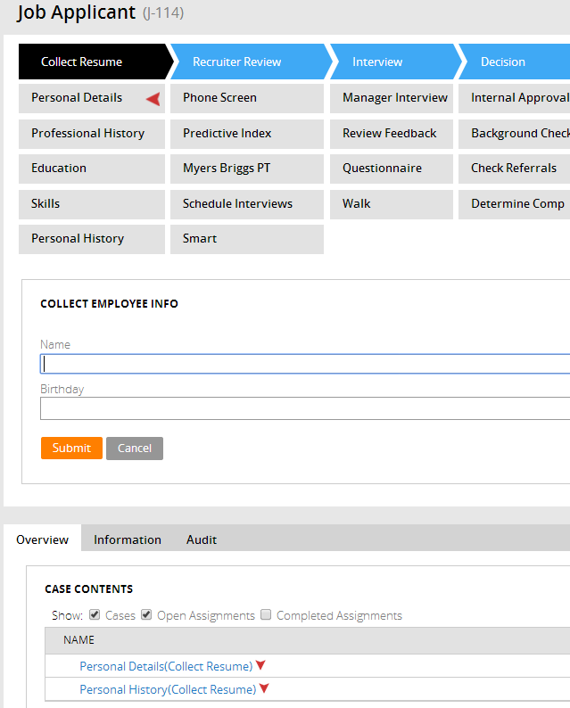
Better visibility for Stages and Steps
Valid from Pega Version 7.1.5
The Stages and Steps display now appears at the top of the action area on perform and review user forms. Previously, the display appeared on the Case Contents Overview tab.
Stages and Steps may not appear as expected
Valid from Pega Version 7.1.5
There are some unique configurations of the newly enhanced pxDisplayStages gadget that can lead to case type "Stages and Steps" appearing more than once or not at all. In the event that your application experiences one of these scenarios, the recommended work around is to relocate the gadget:
- Add pxDisplayStages to the pyCaseContainer section (or equivalent)
- Remove pxDisplayStages from the pyCaseActionArea section (or equivalent).
Stage-related audit notes
Valid from Pega Version 7.1.6
History notes for the following stage-related process steps appear on the user form's Audit tab:
- Automatic Stage Transition
- Manual Stage Transition
- Process Stage Transition
- Stage Skipped
- Stage Started
You can select the ones you want to turn off for a given case type by copying the standard decision tree Work-.FilterHistory to your application ruleset and updating the above parameter entries.
Redesigned Process Modeler property panels
Valid from Pega Version 7.1.6
Process Modeler property panels have been reorganized so that it's easier to find the properties and fields you're likely to want, and quickly create the configuration you need. To enhance ease of use:
- Tabs were eliminated.
- All fields are located on a single panel and are grouped by their function.
- The most commonly used fields appear at the top of the panel and are clearly visible.
- Field and functionality of interest to advanced users are organized into an expandable Advanced section positioned at the bottom of the panel.
- Business-friendly labels and headings, and instructional text make it easier for non-technical users to quickly understand the meaning and purpose of each field.
Dynamic layout improvements
Valid from Pega Version 7.1.6
The following usability improvements have been made to dynamic layouts:
- Refresh conditions can be specified on a dynamic layout. You no longer need to create sections to create refresh boundaries.
- Labels on an included section or nested dynamic layout can be specified with label-positioning specified in the skin.
- Validation errors in a dynamic layout now display below the field.
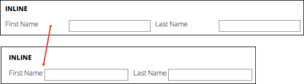
- Use natural label width for inline dynamic layouts so only necessary space is used.
Enhanced layout groups
Valid from Pega Version 7.1.6
Layout groups have been improved with the following features:
- Added "Stacked" layout group that makes it possible for each item to be stacked under the other, with a completely customizable format that can responsively change to other types.
- Include a section as a direct child without the need to wrap it in a dynamic layout.
- Expand multiple accordion panes, allowing users to open any number of panes.