
Accessibility improvements
Valid from Pega Version 7.2
Several improvements are now available that enable application accessibility. These improvements affect the wait indicator, overlays, and collapsible layouts.
The wait indicator, or throbber, announces its status to an assistive technology such as JAWS.
- When loading, the throbber announces “Loading content” or other text that can be edited in the pyThrobberLoadingText property.
- When loading is completed, the throbber announces “Loading completed” or other text that can be edited in the pyThrobberLoadingCompletedText property.
- The loading announcement is set by default to a three-second delay, which can be modified in the pyThrobberAnnouncementDelay property.
Overlays are announced by an assistive technology and overlay content can be tabbed through by using the Tab key without closing the overlay. Overlays can be closed by pressing the Esc key. This behavior applies to all overlays and modal dialog boxes that are opened as local actions and popovers that are part of the autogenerated UI.
All users, including those not using an assistive technology, can focus the expand and collapse feature of a layout by using the Tab key. The expanded or collapsed state is announced by screen readers.
Improved UI accessibility
Valid from Pega Version 8.6
Pega Platform™ now supports W3C Web Accessibility Initiative guidelines more fully, which creates a better user experience for people who rely on assistive technologies, such as screen readers.
The user interface now features the following enhancements:
- Improved keyboard navigation and updated ARIA attributes for layouts, including dynamic, repeating, and table layouts.
- Updated navigation for AJAX and dynamic containers.
- More precise keyboard navigation and focus control for pop-up components, such as SmartTips.
- Fixed accessibility gaps in out-of-the-box actionable controls and form components, such as buttons and text fields.
- More accessible error messages with improved color schemes and focus control. To meet the WCAG ARIA guidelines, the Show next Error bar has been retired and substituted with more accessible error symbols.
- Accessibility code included in the Pega Platform ruleset by default, without the need for additional configuration.
For more information, see Supported keyboard navigation.
Add custom controls to section palettes
Valid from Pega Version 7.3
You can add custom controls to the Basic or Advanced palettes in sections. With this enhancement, Pega® Platform developers have easy access to custom controls. The check box is available in the HTML tab of the custom control rule. You can add a custom icon to display in the menu with the custom control.
For more information see Adding custom controls to the section palette in Designer Studio.
Manage test ID access with an access group role
Valid from Pega Version 8.2
Test IDs for user interface components are available only to users who have the PegaRULES:TestID role added to their access group. This requirement allows administrators to limit access to test IDs to users who create or run tests. At run time, applications do not include the test ID data for users without the PegaRULES:TestID role, which reduces the amount of code that is downloaded to the client.
For more information see Managing Test ID access with an access group role
Extended currency control
Valid from Pega Version 7.1.4
The currency control can now display a different currency than the locale currency. This means a user in one country can view amounts that are designated in a foreign currency, using that currency's international conventions. For example, a credit card transaction in Germany might need to be posted in US dollars.
Attach Content control
Valid from Pega Version 7.1.5
The Attach Content control assists with attaching and uploading media files for Pega 7 applications. When in a mobile web browser, this control is limited to attaching image files only. Using a desktop browser with this control enabled launches the file browser, allowing users to select a type of capture mechanism and/or utilize an "attach file(s)" file selection prompt directly from their desktop.
DateTime control enhancements
Valid from Pega Version 7.3.1
The DateTime (calendar) control has been updated. You can now show week numbers on the calendar, disable weekends so that users cannot select them as working days, show minutes in intervals, and use spinners to facilitate navigating between months and years. These design-time options make it easier for users to select valid dates and times in your applications.
For more information, see Adding and configuring a DateTime control.
Improved accessibility support
Valid from Pega Version 7.1.4
PRPC support for accessibility has been enhanced to allow applications to better meet the standards of the Web Content Accessibility Guidelines (WCAG), 2.0 AA.
Updates to the Attach Content control
Valid from Pega Version 7.1.7
Several updates have been made to the Attach Content (pxAttachContent) control, resulting in a faster and more efficient file attachment process. New features include:
- Responsive UI that allows the control attachment screen to conform to various UI sizes across any device accessing the application
- A bigger drop-zone for adding files
- The option to simultaneously add multiple files when using either the file browser or drag-and-drop functionality
- The ability to display the control as either a button, link, or as an icon within an application
- Built-in camera integration on mobile devices, which supports the selection of image files directly from a mobile device’s camera roll
- Safeguards that halt the attachment process upon cancelling an attach action
For more information, see PDN article: How to use the Attach Content control.
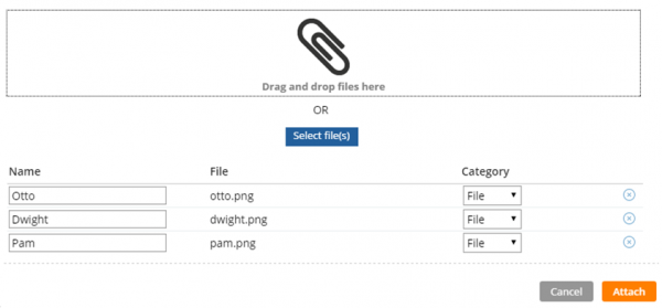
Drag and drop or add multiple files at once
Format options in DateTime control
Valid from Pega Version 7.1.5
Several updates were made to the section and harness DateTime control.
First, this control now allows selection of both the MM/DD/YYYY and the DD/MM/YYYY format from the Date format dropdown menu.
Second, the number of characters used when inputting a date will be the same regardless of the date. For example, 1/1/2014 displays as 01/01/2014. In a data grid, this ensures that the date text in a column is aligned.
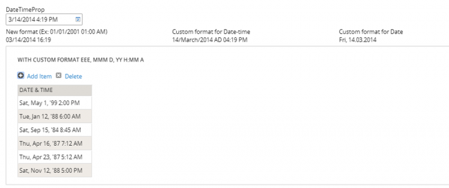
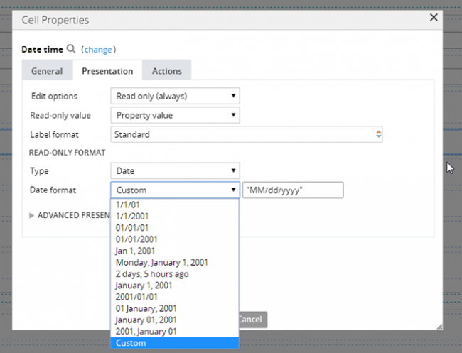
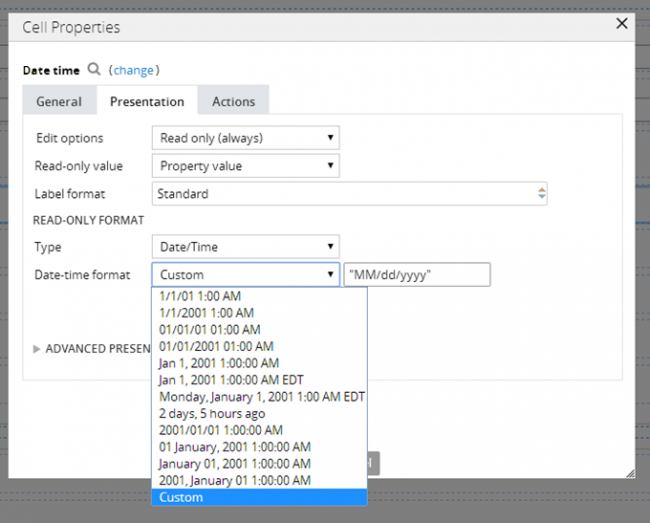
Third, you can now create a custom date format using the Java-supported custom date formats for both the Date or Date/Time types.
Following is an example of the new dropdown when selecting the type Date:
Following is an example of the new dropdown when selecting the type Date/Time:
Finally, as an example of custom date and time formatting, entering EEE, MMM D, YY H:MM A in the "Custom" field displays as Sat, May 1, '99 2:00 PM, as shown below: