
Specify control widths in the skin
Valid from Pega Version 7.1.5
This feature enables you to control the width of controls added to dynamic layouts instead of using the default 100% width of the dynamic layouts. You can now specify the widths as dynamic layout skin settings.
Enhanced Rich Text Editor control
Valid from Pega Version 7.1.5
The Rich Text Editor control, available under the control group when using the section editor in Designer Studio, has been updated to the most recent version.
The major features of this update include:
- Hyperlink creation at design time or runtime
Access to the rich text source mode
- Drag and drop functionality and copy and paste functionality for inserting images directly into the WYSIWYG editing field at runtime.
Additionally, this control is now compatible up through Internet Explorer 11, along with current versions of both the Mozilla Firefox and Google Chrome browsers.
Link configuration in grid columns
Valid from Pega Version 7.1.5
Grid columns now support configuring a link with either simple text (or field value) or with a property reference.
To configure a link, in Designer Studio, add a link control to a section from the Basic control group. Click the gear icon in the link control to open the Cell Properties dialog. In the Link caption field, select either Field Value, Parameter, Text, or Property Reference.
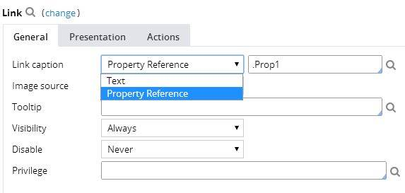
For each selection:
- Field value displays a field value picker
- Parameter displays the list of parameters associated with the section in a dropdown
- Text displays a text input
- Property Reference displays a property picker
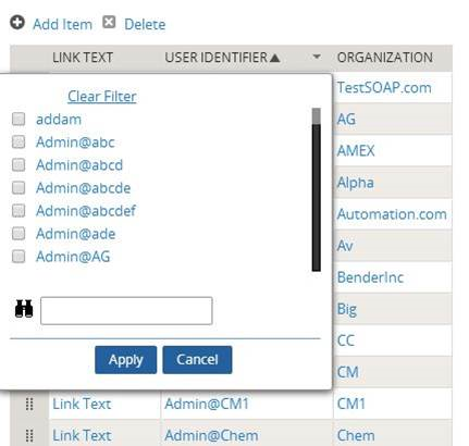
Selecting Property Reference allows grid columns to be sorted and filtered, as shown below:
Attach Content control
Valid from Pega Version 7.1.5
The Attach Content control assists with attaching and uploading media files for Pega 7 applications. When in a mobile web browser, this control is limited to attaching image files only. Using a desktop browser with this control enabled launches the file browser, allowing users to select a type of capture mechanism and/or utilize an "attach file(s)" file selection prompt directly from their desktop.
Display dropdown lists in descending order
Valid from Pega Version 7.1.5
The dropdown grouping feature now allows you to display a list of groups in both "Ascending order" and "Descending order". Previously, only Ascending order was available.
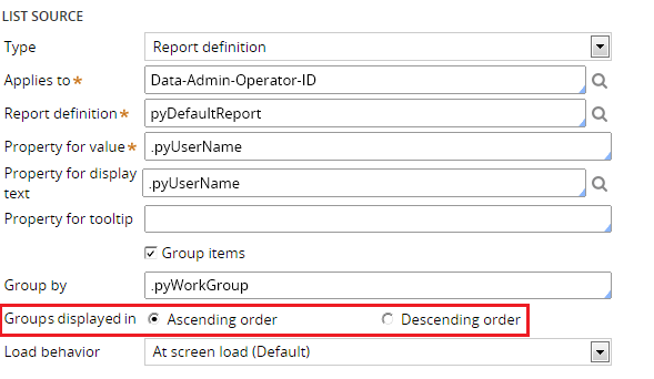
This feature is available on the General tab of the Cell Properties dialog in Designer Studio.
Text Input control number type does not validate
Valid from Pega Version 7.1.5
When a Text Input control type is set to "Number" in the Presentation tab:
- Validation does not trigger and the field is blanked out when a user submits the form.
- If a value other than a number is entered, the browser sends an empty value, and the value is not validated.
- In the Clipboard, the field value displays as empty.
- If the field is required, the validation displays.
This issue occurs when using both the Chrome and Safari web browsers, and is a result of browser behavior for the HTML5 type=“number”. To fix this issue when using these browsers, do not use the "Number" type in Presentation tab of a Text Input control. Instead, the type should be set to "Text".
Unclear error message when saving shared class instance in tenant layer
Valid from Pega Version 7.1.5
If you attempt to save a shared class instance from the tenant layer, Pega 7 displays this message:
This record has x errors. Save Failed: There was a problem saving an instance of class: Error Code: <none> SQL State: <none> Message: <none>
You cannot save a shared instance from the tenant layer if that instance cannot be overridden.
Semantic URLs in Pega Platform
Valid from Pega Version 8.5
URL addresses for Pega Platform™ applications and application resources now appear as clear, meaningful paths. This enhancement helps users understand the structure of the application that they are using, which makes navigation quicker and more intuitive.
Default views for cases and data objects
Valid from Pega Version 8.5
Pega Platform™ now generates default views for new case types and data objects. Because of this feature, your application now automatically creates a case summary and case details view for every new case type, and a list view for each data object. The default views automate a common recurring task, and improve productivity by reducing development effort.
Improved view authoring
Valid from Pega Version 8.5
Case authoring in Cosmos React UI now features updated view authoring tools. The redesigned view tab and overlay provide a more intuitive interface for creating views, applying design templates, and adding fields and controls. This enhanced work environment improves the user experience and reduces context switching, which contributes to a lower development effort.
For more information, see Editing views in a case type.