
Updates to the Attach Content control
Valid from Pega Version 7.1.7
Several updates have been made to the Attach Content (pxAttachContent) control, resulting in a faster and more efficient file attachment process. New features include:
- Responsive UI that allows the control attachment screen to conform to various UI sizes across any device accessing the application
- A bigger drop-zone for adding files
- The option to simultaneously add multiple files when using either the file browser or drag-and-drop functionality
- The ability to display the control as either a button, link, or as an icon within an application
- Built-in camera integration on mobile devices, which supports the selection of image files directly from a mobile device’s camera roll
- Safeguards that halt the attachment process upon cancelling an attach action
For more information, see PDN article: How to use the Attach Content control.
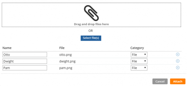
Drag and drop or add multiple files at once
Update to UI-Kit-7:02-01-01 for latest features and mobile-ready Case Worker portal
Valid from Pega Version 7.1.7
The UI Kit ruleset (UI-Kit-7:02-01-01) contains the latest rules and a skin (pyEndUser71) for use in building or customizing Pega 7 user interfaces. Updating to this version allows you to take advantage of the newest features and styling, including a new responsive Case Worker portal.
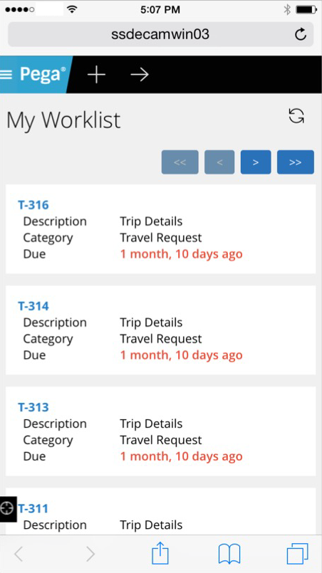
Mobile view of the Case Worker portal
Like the Case Manager portal, the Case Worker portal is mobile-ready and provides case workers with a standard user interface for:
- Displaying a worklist of all open cases
- Viewing information about cases associated with case types defined in the Case Explorer
- Displaying a calendar view of work assignments
- Updating the user's profile
For more information, see Using the UI Kit ruleset.
Paragraph rule responsive images
Valid from Pega Version 7.1.7
Images inserted in a paragraph rule can be configured to resize in response to the browser size, allowing an end-user to view the entire image without scrolling. Select the Auto resize check box in the paragraph rule Image Properties dialog to enable image responsiveness.
New menu design options with the auto-generated menu control
Valid from Pega Version 7.1.7
Usability and responsive capabilities have been enhanced with a new auto-generated menu control offering multiple design options and configurations. New display options include text, descriptions, badges, and responsive vertical in-line menus. Loading options include:
- At screen load
- Defer load
- On first use
- On every use
Show menu controls for existing applications can be upgraded using the Upgrade Show Menu button in the HTML5 Readiness feature.

Menu created using the auto-generated menu control
Table toolbar functions
Valid from Pega Version 8.3
Optimized tables now support a table toolbar, that provides application users with the ability to adjust the data display to their needs. The toolbar conveniently groups several standard functions and custom actions. By using the toolbar, users can change the visibility of columns, group table data by fields, adjust the height of rows, and then save their personalized view. The toolbar is generated automatically, which provides a consistent design throughout your application.
For more information, see Configuring the table toolbar.
Swipe action added for mobile navigation of layout groups
Valid from Pega Version 7.1.7
You can now swipe to navigate across available content in the tabbed or menu-style layout groups by simply enabling swipe on the layout group property panel.
With this setting, visible indicators appear on the left and/or right when there is additional content to view. The swipe indicators display when a user taps down on their touch device and disappears when the user taps up (lifts) from the screen or moves to another area. Additionally, you can use custom CSS to change the fade-in and fade-out behaviors of the swipe indicators.
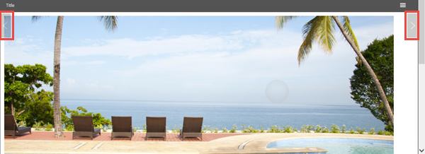
Left and right swipe indicators in a layout group
For example, when you display a tabbed representation on a desktop that switches to a menu format at a breakpoint, the mobile user no longer has to select a menu option by touching the header to disclose the available menu item. Instead, the mobile user can simply swipe the content and navigate to either the next or previous layout and the menu updates to the current selected layout.