
Internet Explorer 11 support
Valid from Pega Version 7.1.5
7.1.5 now provides support for Internet Explorer 11 (IE11). For those customers interested in information about IE11 support in previous releases, refer to the Platform Support Guide.
Automatically remove all inline styles
Valid from Pega Version 7.1.5
To ensure reusability and ease of maintenance, you can remove inline styles from all sections in all unlocked ruleset versions in your application from thelanding page. In the Sections Using Inline Styles section, click the Remove inline styles from all sections button.
Automatically upgrade smart layouts to dynamic layouts
Valid from Pega Version 7.1.5
An automated command that upgrades from a smart layout to a dynamic layout is available in Designer Studio when creating new section layouts. Note that some smart layout configurations may not have a one-to-one correspondence with dynamic layouts, so these require some modification.
Format options in DateTime control
Valid from Pega Version 7.1.5
Several updates were made to the section and harness DateTime control.
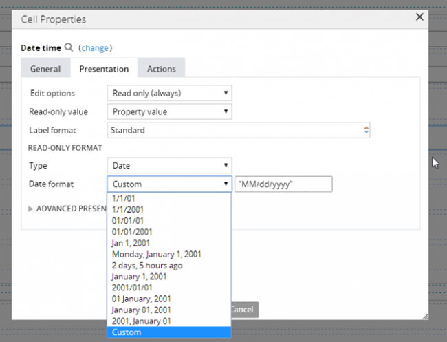
First, this control now allows selection of both the MM/DD/YYYY and the DD/MM/YYYY format from the Date format dropdown menu.
Second, the number of characters used when inputting a date will be the same regardless of the date. For example, 1/1/2014 displays as 01/01/2014. In a data grid, this ensures that the date text in a column is aligned.
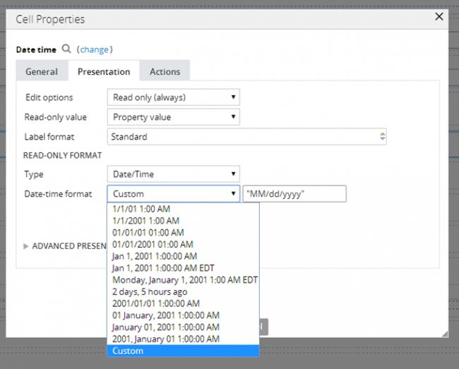
Third, you can now create a custom date format using the Java-supported custom date formats for both the Date or Date/Time types.
Following is an example of the new dropdown when selecting the type Date:
Following is an example of the new dropdown when selecting the type Date/Time:
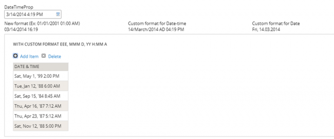
Finally, as an example of custom date and time formatting, entering EEE, MMM D, YY H:MM A in the "Custom" field displays as Sat, May 1, '99 2:00 PM, as shown below:
Specify control widths in the skin
Valid from Pega Version 7.1.5
This feature enables you to control the width of controls added to dynamic layouts instead of using the default 100% width of the dynamic layouts. You can now specify the widths as dynamic layout skin settings.
Enhanced Rich Text Editor control
Valid from Pega Version 7.1.5
The Rich Text Editor control, available under the control group when using the section editor in Designer Studio, has been updated to the most recent version.
The major features of this update include:
- Hyperlink creation at design time or runtime
-
Access to the rich text source mode
- Drag and drop functionality and copy and paste functionality for inserting images directly into the WYSIWYG editing field at runtime.
Additionally, this control is now compatible up through Internet Explorer 11, along with current versions of both the Mozilla Firefox and Google Chrome browsers.
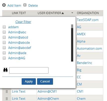
Link configuration in grid columns
Valid from Pega Version 7.1.5
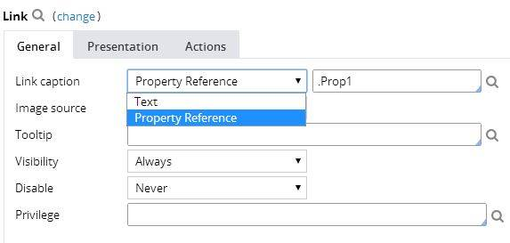
Grid columns now support configuring a link with either simple text (or field value) or with a property reference.
To configure a link, in Designer Studio, add a link control to a section from the Basic control group. Click the gear icon in the link control to open the Cell Properties dialog. In the Link caption field, select either Field Value, Parameter, Text, or Property Reference.
For each selection:
- Field value displays a field value picker
- Parameter displays the list of parameters associated with the section in a dropdown
- Text displays a text input
- Property Reference displays a property picker
Selecting Property Reference allows grid columns to be sorted and filtered, as shown below:
Attach Content control
Valid from Pega Version 7.1.5
The Attach Content control assists with attaching and uploading media files for Pega 7 applications. When in a mobile web browser, this control is limited to attaching image files only. Using a desktop browser with this control enabled launches the file browser, allowing users to select a type of capture mechanism and/or utilize an "attach file(s)" file selection prompt directly from their desktop.
Display dropdown lists in descending order
Valid from Pega Version 7.1.5
The dropdown grouping feature now allows you to display a list of groups in both "Ascending order" and "Descending order". Previously, only Ascending order was available.
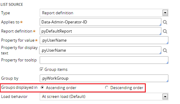
This feature is available on the General tab of the Cell Properties dialog in Designer Studio.
Text Input control number type does not validate
Valid from Pega Version 7.1.5
When a Text Input control type is set to "Number" in the Presentation tab:
- Validation does not trigger and the field is blanked out when a user submits the form.
- If a value other than a number is entered, the browser sends an empty value, and the value is not validated.
- In the Clipboard, the field value displays as empty.
- If the field is required, the validation displays.
This issue occurs when using both the Chrome and Safari web browsers, and is a result of browser behavior for the HTML5 type=“number”. To fix this issue when using these browsers, do not use the "Number" type in Presentation tab of a Text Input control. Instead, the type should be set to "Text".