
Addition of Data Access Tab to access control policy condition rules
Valid from Pega Version 8.6
You can now select associations and declarative index classes when creating access control policy condition rules. The C field in the policy condition can now accept properties from available associations and indexes. For ease of reference, the selected associations and indexes are available on the new tab.
Using the new tab, you can build complex authorization models in which access restrictions for a class depend on the attributes present in the associated and indexed classes, along with the attributes in the current class. For example, a project management application can now separately maintain project lists for each operator and use that information to restrict read/write access to unique projects.
The information available on the new Data Access tab reflects rule form changes, which are similar to the existing functionality of the Report Definition in the Application Data Model.
For more information, see Creating an access control policy condition.
Use client-based access control to support EU GDPR requirements
Valid from Pega Version 8.1
You can use client-based access control (CBAC) to satisfy the data privacy requirements of the European Union General Data Protection Regulation (GDPR) and similar regulations. By using client-based access control, you can identify the personal data of clients and automatically process requests to view, update, or remove the data in a secure manner. You can also enforce restrictions on the use of this data in application functions.
For more information, see Client-based access control.
Improved UI accessibility
Valid from Pega Version 8.6
Pega Platform™ now supports W3C Web Accessibility Initiative guidelines more fully, which creates a better user experience for people who rely on assistive technologies, such as screen readers.
The user interface now features the following enhancements:
- Improved keyboard navigation and updated ARIA attributes for layouts, including dynamic, repeating, and table layouts.
- Updated navigation for AJAX and dynamic containers.
- More precise keyboard navigation and focus control for pop-up components, such as SmartTips.
- Fixed accessibility gaps in out-of-the-box actionable controls and form components, such as buttons and text fields.
- More accessible error messages with improved color schemes and focus control. To meet the WCAG ARIA guidelines, the Show next Error bar has been retired and substituted with more accessible error symbols.
- Accessibility code included in the Pega Platform ruleset by default, without the need for additional configuration.
For more information, see Supported keyboard navigation.
Accessibility Inspector identifies accessibility issues in real time
Valid from Pega Version 8.1
The new Accessibility Inspector finds accessibility issues in your application and helps you to quickly fix these issues. Accessible applications accommodate a range of users with varying degrees of visual ability and might be required by regulation. The Accessibility Inspector, which you open from the run-time toolbar, is displayed on the right side of the page and highlights content, structure, compatibility, and interaction issues. You can click through an accessibility warning to open the affected element and fix the issue. For more information, see Finding accessibility issues in Pega applications with the Accessibility Inspector.
Enabling access to upgraded help
Valid from Pega Version 8.1
After upgrading to Pega Platform ™ 8.1, the default URL to the upgraded help files might be incorrect. To enable access to the latest help files, reset the URL:
- In the header of Dev Studio, click .
- Enter the Online Help URL:
https://community.pega.com/sites/default/files/help_v81/
- Click .
- Log out and log back into Pega Platform.
Updates to the Attach Content control
Valid from Pega Version 7.1.7
Several updates have been made to the Attach Content (pxAttachContent) control, resulting in a faster and more efficient file attachment process. New features include:
- Responsive UI that allows the control attachment screen to conform to various UI sizes across any device accessing the application
- A bigger drop-zone for adding files
- The option to simultaneously add multiple files when using either the file browser or drag-and-drop functionality
- The ability to display the control as either a button, link, or as an icon within an application
- Built-in camera integration on mobile devices, which supports the selection of image files directly from a mobile device’s camera roll
- Safeguards that halt the attachment process upon cancelling an attach action
For more information, see PDN article: How to use the Attach Content control.
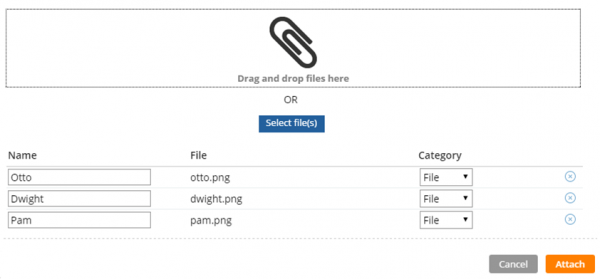
Drag and drop or add multiple files at once
Enhanced chart control improves displaying data as a chart
Valid from Pega Version 7.1.7
The renewed chart control has an improved properties panel and provides HTML5-compliant pie, column, bar, area, line, and gauge charts. The chart source can be a report definition, a clipboard page, or a data page. You can customize basic and threshold colors, borders, line widths, labels, and other chart elements. A preview on the property panel instantly displays the effects on the chart of property changes you make.
For more information, see Harness and section forms - Adding a chart.
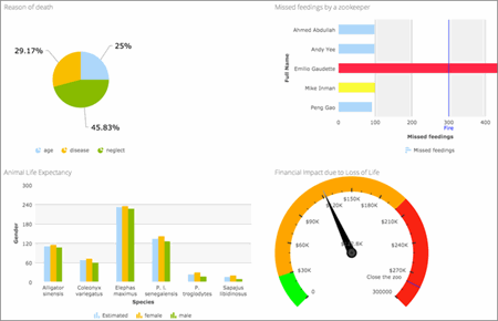
HTML5-compliant chart types
Mobile optimized date and time controls
Valid from Pega Version 7.1.7
Date and time controls now support mobile browser-native date and time pickers on Android and iOS, making date and time selections easier for the end-user. This option is enabled in the Presentation tab of the Text input control Cell properties panel.
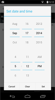
Native date and time selection on Android
Autogenerated controls have unique IDs
Valid from Pega Version 8.1
Autogenerated controls have a unique ID by default. This unique ID ensures that the Document Object Model (DOM) is HTML5-compliant and avoids problems that can be caused by elements having the same ID. The setting to enable or disable unique IDs is on the HTML5 Application Readiness page.
For more information, see Unique IDs in autogenerated controls.
Enhanced run-time behavior of the currency and number controls
Valid from Pega Version 8.6
The currency and number controls now display separators at run time, even as the user types the values. When the user enters more than three digits, a locale-dependent separator immediately groups the digits into thousands in real time. For example, when a user who is based in the U.S. types 100000, the input field displays the number as 100,000. The currency control additionally displays currency symbols at all times, whether the input field is in focus or not.
This enhancement improves clarity and the user experience because the user no longer needs to move away from the field to see the formatting of the input, and typing long strings of numbers is now more convenient.
For more information, see Controls.