
Mobile tab UI updates
Valid from Pega Version 7.1.7
The Mobile tab (formerly the Mobile Settings tab) on the Application Definition in Designer Studio includes an updated UI and enhanced functionality in this release. This includes:
- When using the default options on the Mobile tab, URLs and QR codes display that link to the Pega 7 mobile application download page on the Apple iTunes and Google Play app stores, providing easier direct access to this app.
- Push notifications can be enabled and configured for both iOS and Android hybrid mobile applications (previously, only iOS apps could use this feature).
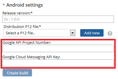
Configure push notifications for a hybrid mobile application using the updated fields on the Mobile tab - Warning messages display when building a hybrid mobile application to assist users if any incorrect or incomplete information is entered into a required field.
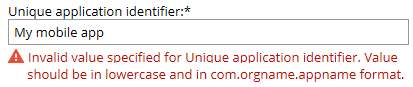
An example of an error message
For more information, see PDN article How to build and brand a hybrid mobile application.
Updated Pega 7 mobile application
Valid from Pega Version 7.1.7
The Pega 7 mobile application, available for download in the Apple iTunes and Google Play stores, has been updated in this release. New features and enhancements include:
- iOS 8.0 support
- Android 5.0 Lollipop support (once released)
- App size reduced by over 30%
- Faster app download
- Improved logging
- New Javascript APIs available, including:
- Native SQL API for custom offline app development
- File transfer capability for background photo and video upload

Use the QR codes on the Mobile tab in Designer Studio to quickly access the Pega 7 mobile app download page.
Test ID added for unique identification of UI elements during testing
Valid from Pega Version 7.1.7
A unique Test ID property has been added to support automated testing, enabling you to write dependable automated tests against any Pega application. By including this unique identifier in your automated testing, you ensure a higher level of productivity and reliability within your applications. For more information see Test ID and Tour ID for unique identification of UI elements.
Live UI enables runtime editing for less technical users, replaces UI Inspector and UI Tree
Valid from Pega Version 7.1.7
The previous UI Tree and UI Inspector tools have been replaced by the newly enhanced Live UI tool. Offering true WYSIWYG editing, less technical users can make UI adjustments at runtime and publish or discard changes on the fly through automated rule management using a new runtime branch governance model.
With Live UI, you can:
- Publish and discard records as a batch or individually.
- Display detailed information about Pega artifacts and open rules automatically at runtime.
- Inspect detailed setup for an element by opening its properties panel and then edit directly from within the UI (if enabled).
- Undo the last change you made in the tool.
- Copy items to the scratch pad for use in reporting.
- Display a breadcrumb trail that lists immediate ancestors.
You can make on-the-fly changes at runtime by clicking the gear icon to edit the properties panel.
Live UI is not supported in Internet Explorer 8. Internet Explorer 8 users will see the older UI Inspector tool in Designer Studio.
For more information, see How to use the Live UI tool.
Swipe action added for mobile navigation of layout groups
Valid from Pega Version 7.1.7
You can now swipe to navigate across available content in the tabbed or menu-style layout groups by simply enabling swipe on the layout group property panel.
With this setting, visible indicators appear on the left and/or right when there is additional content to view. The swipe indicators display when a user taps down on their touch device and disappears when the user taps up (lifts) from the screen or moves to another area. Additionally, you can use custom CSS to change the fade-in and fade-out behaviors of the swipe indicators.
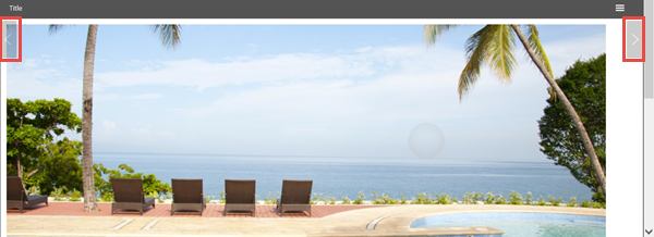
Left and right swipe indicators in a layout group
For example, when you display a tabbed representation on a desktop that switches to a menu format at a breakpoint, the mobile user no longer has to select a menu option by touching the header to disclose the available menu item. Instead, the mobile user can simply swipe the content and navigate to either the next or previous layout and the menu updates to the current selected layout.
View agent activity and status more efficiently
Valid from Pega Version 7.1.7
The menu has been updated with several additional tabs detailing system information pertinent to an active server node running on a system, along with its requestors, log utilities, and purge/archive utilities. The link to the System Management Application tool has also been moved to the menu in this release.
Previously, to understand your system, you had to access every node on your system individually. With this update, the information available on these tabs allows you to view all agents across a cluster to determine if an agent is active and in-depth details about the agent in a more efficient manner.
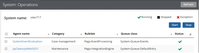
The System: Operations page displays agent information and status on a system
Access this menu by selecting . For more information, see the System Operations landing page.
Actionable layouts improve mobile experience
Valid from Pega Version 7.1.7
Interactive layouts are now easier to use from a mobile device. With the added ability to specify events and actions on dynamic layouts rather than on individual items, you can deliver enhanced user interface interaction from a mobile device. For example, you can configure interaction with an entire tile rather than individual elements of the tile for easier tapping.
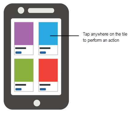
Configure an entire tile for easier interaction from a mobile device
From the Actions tab of the Dynamic layout properties panel, you can define an action set and then add events and actions. Actions on nested layouts or controls take precedence when acted upon.
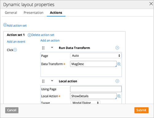
Specify events and actions from the Actions tab of the properties panel
Changes to default Agent settings
Valid from Pega Version 7.1.7
Default agent settings across several rulesets have been updated in this release. Changes to settings include agents that are now:
- Disabled by default
- Scheduled to run at a recurring designated time interval (in seconds)
- Scheduled to run daily at a specified time
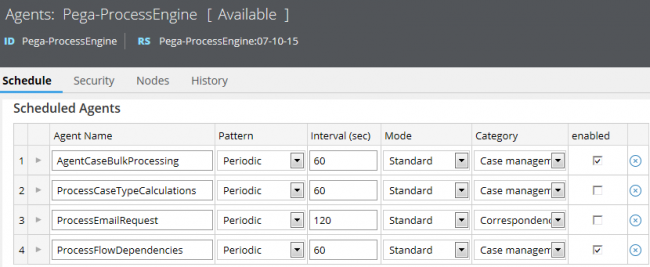
An example of some updated default agent settings. Compared to earlier versions, you can see in Pega 7.1.7 that ProcessCaseTypeCalculations and ProcessFlowDependencies are now set to run every 60 seconds, and that ProcessEmailRequest is disabled.
This update allows operations staff to understand the general purpose of an agent by product, and enhances usability of this information by improving navigation of agents in large systems through filtering and sorting.
For more information, see Changes to default agent settings in Pega 7.1.7.
Update to UI-Kit-7:02-01-01 for latest features and mobile-ready Case Worker portal
Valid from Pega Version 7.1.7
The UI Kit ruleset (UI-Kit-7:02-01-01) contains the latest rules and a skin (pyEndUser71) for use in building or customizing Pega 7 user interfaces. Updating to this version allows you to take advantage of the newest features and styling, including a new responsive Case Worker portal.
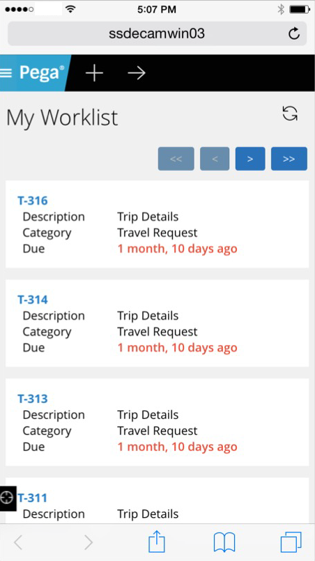
Mobile view of the Case Worker portal
Like the Case Manager portal, the Case Worker portal is mobile-ready and provides case workers with a standard user interface for:
- Displaying a worklist of all open cases
- Viewing information about cases associated with case types defined in the Case Explorer
- Displaying a calendar view of work assignments
- Updating the user's profile
For more information, see Using the UI Kit ruleset.
Replacement for window.showModalDialog
Valid from Pega Version 7.1.7
With Google Chrome disabling showModalDialog in Chrome 37, it is recommended to upgrade your application to use auto-generated local actions. To make it easy to identify where showModalDialog is used in your application, an alert window displays when the window.showModalDialog API is used in your application.
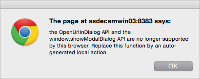
An alert window provides better feedback than a JavaScript exception.