
Actionable layouts improve mobile experience
Valid from Pega Version 7.1.7
Interactive layouts are now easier to use from a mobile device. With the added ability to specify events and actions on dynamic layouts rather than on individual items, you can deliver enhanced user interface interaction from a mobile device. For example, you can configure interaction with an entire tile rather than individual elements of the tile for easier tapping.
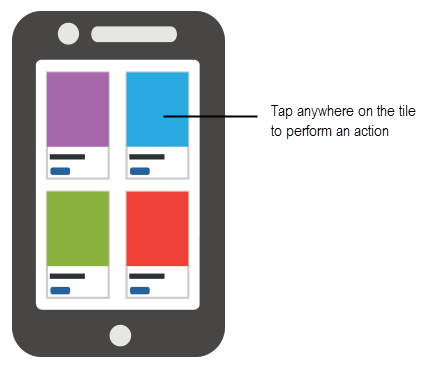
Configure an entire tile for easier interaction from a mobile device
From the Actions tab of the Dynamic layout properties panel, you can define an action set and then add events and actions. Actions on nested layouts or controls take precedence when acted upon.
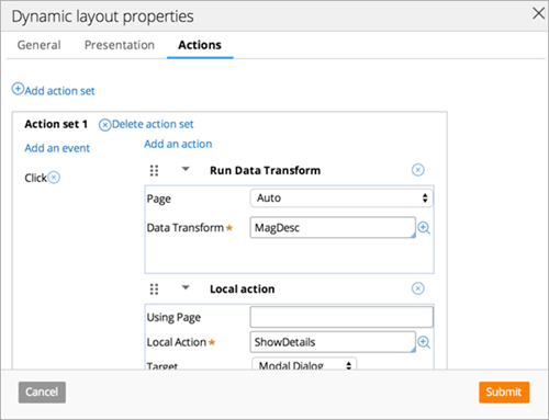
Specify events and actions from the Actions tab of the properties panel
Mobile tab UI updates
Valid from Pega Version 7.1.7
The Mobile tab (formerly the Mobile Settings tab) on the Application Definition in Designer Studio includes an updated UI and enhanced functionality in this release. This includes:
- When using the default options on the Mobile tab, URLs and QR codes display that link to the Pega 7 mobile application download page on the Apple iTunes and Google Play app stores, providing easier direct access to this app.
- Push notifications can be enabled and configured for both iOS and Android hybrid mobile applications (previously, only iOS apps could use this feature).
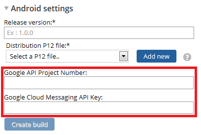
Configure push notifications for a hybrid mobile application using the updated fields on the Mobile tab - Warning messages display when building a hybrid mobile application to assist users if any incorrect or incomplete information is entered into a required field.
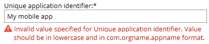
An example of an error message
For more information, see PDN article How to build and brand a hybrid mobile application.
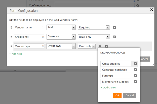
Streamlined Form Configuration dialog
Valid from Pega Version 7.1.5
The Form Configuration dialog presents an easy to use interface for managing fields in user forms. New features and capabilities include the following:
- You can create a field by entering its short description, field type, and attributes without having to open a property form.
- The list of available field types has been simplified and organized into two groups: Single Value and Complex Types (page and page list).
- Single value fields are configured and labeled so business users can more easily understand their purpose. For example, a currency field represents a decimal property type that is displayed in a currency control.
- When adding a calculated value, you can create a simple Declare Expression directly from the mode field. See Use the Form Configuration dialog to automatically create a Declare Expression.
- When adding a dropdown field, you can specify the list's choices directly in a pop-up dialog. The system automatically creates the property and populates the values in a Prompt List table.
- When adding a page or page list, the system automatically creates a new data type. Alternatively, you can reuse an existing data type by clicking the gear icon
 to display a Data Type dialog. If the data type selected has data pages defined on it, you can set the field to be automatically sourced at runtime. Once finished, the system will automatically select fields from the data type for you to reuse.