
 Bubble
chart
Bubble
chart
Bubble
chart
Bubble
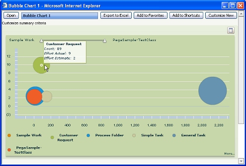
chartA bubble chart presents three dimensions of data in a two-dimensional format. PROJ-200
Points appear within horizontal and vertical axes to represent two of the three dimensions. A colored circle or bubble presents the third dimension.
For example, the following chart contains one color-coded bubble for each of the six work types in a work pool; one bubble is obscured.
Hold the mouse pointer over any bubble to view the data values.
To create an interactive bubble chart:
Interactive as the Chart Output
Type.Bubble type.
|
interactive chart, slider |

|
About Summary View rules |
 Definitions —
B
Definitions —
B