|
Apply fonts and colors to SmartInfo pop-up windows.
— In the Header subsection, specify colors and fonts that are applied to the window header. You can individually modify the label and data values by clearing the Use the same formatting for Labels and Data Values checkbox. For bold text, check Bold.
— In the Body subsection, define the text padding. You can specify one setting for all sides or a setting for each side.![]() Label and data value styles in the body are defined in the Controls category.
Label and data value styles in the body are defined in the Controls category.
— In the Smart Label subsection, specify the font and color applied to the Smart Label control.
See SmartInfo and Harness, Section, and Flow Action forms — Adding a SmartLabel
For modal dialogs, modify the border, the header text, border and background, and the padding used in the body.
Modify the colors applied to the area surrounding buttons on harnesses. The Accent color is the default.
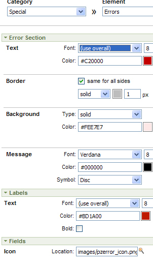
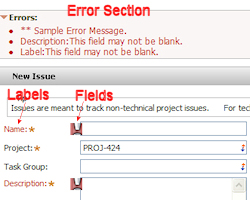
Modify the settings in the Error Section for form-level errors, and Labels and Fields sections for field-level errors. To make errors stand out, it is recommended that you use fonts and background colors that contrast with those applied to other UI elements. Here is an example of the settings and how they appear to the user. V6.2 GRP-22459 pashm
Wizard settings:

As they appear to the user (corresponding settings captioned here):

The default colors are the Main and Accent colors applied in Quick Create. Preview is not available for these settings.
Apply colors and fonts to the header and left panel sections used in WizardScreenFlow harness rule instances. Use the Hover setting if you want to apply a different text color when the cursor is placed over a label in the left panel. The default background uses the Accent color. Preview is not available for these settings. See Tools, Accelerators, and Wizards.
![]() Colors and fonts used in the button area at the foot of the harness are defined in the Controls category.
Colors and fonts used in the button area at the foot of the harness are defined in the Controls category.
The Main colors are applied to the background by default. Preview is not available for these settings.
Click Preview to open in a new window a rendering of the UI elements as configured so far. To view the rendering on a traditional Pega portal, click Preview Traditional Portal in the preview window.
Click Next>> to advance to Custom, Step 5.
Click <<Back to return to the previous step.
Click Save to save your updates to the skin rule.
Click Cancel to discard your updates and exit the wizard.
Click Finish to save your updates and exit
the wizard. This action opens a panel containing an array of rules
comprising the skin and its associated portal and text rules. Click the
edit button (![]() ) to open a rule. From this form, click Reopen Skin to return to the first step, or
click Cancel to exit the wizard.
) to open a rule. From this form, click Reopen Skin to return to the first step, or
click Cancel to exit the wizard.