Formats
Configuration formats determine the type of element defined in the component definition file, and how a field is displayed visually.
Boolean
Presents the user with a checkbox, as shown in the following figure:
BOOLEAN format property pane
The following example code snippet shows the configuration of the
BOOLEAN format in the component definition
file:
{
      "name": "showGroupSeparators",
      "label": "Show thousands separator",
      "format": "BOOLEAN",
      "visibility": "(!$this.displayAs = slider)"
}
Cascade
Shows or hides fields that are nested under a format attribute based on the values
that are specified in the source object. You specify the cascading
elements in the cascadeElements array and use the
match attribute to specify the value to show when displaying
the elements. The following figure shows an example of the CASCADE
format with the fields (cascadeElements) displayed based on the
selection in the Format field:
CASCADE format property pane with the cascading
fields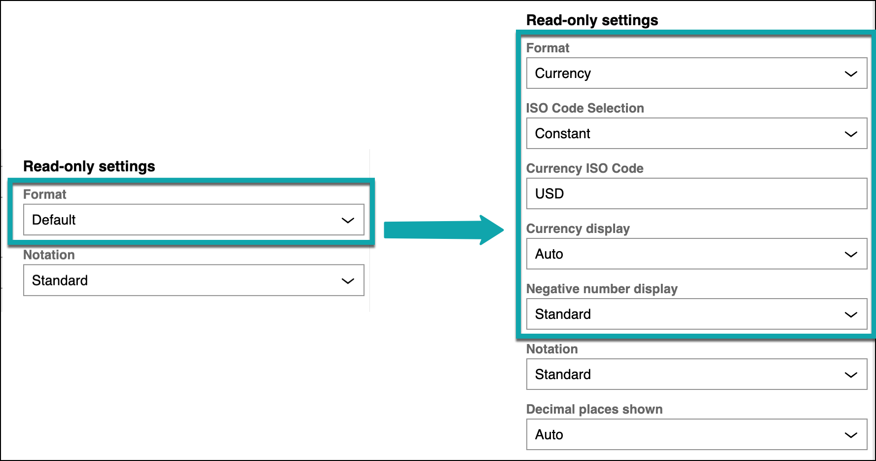
The following example demonstrates an implementation of CASCADE in
the SELECT format:
{
  "format": "CASCADE",
  "visibility": "(formatter = Currency)",
  "source": {
     "format": "SELECT",
     "label": "ISO Code Selection",
     "name": "isoCodeSelection",
     "defaultValue": "constant",
     "source": [
         {
           "key": "constant",
           "value": "Constant"
         },
         {
           "key": "propertyRef",
           "value": "Property Reference"
         }
        ]
       },
     "cascadeElements": [
         {
           "key": "currencyISOCode",
           "format": "TEXT",
           "name": "currencyISOCode",
           "label": "Currency ISO Code",
           "defaultValue": "USD",
           "match": "constant"
         },
         {
           "key": "currencyISOCode",
           "format": "PROPERTY",
           "name": "currencyISOCode",
           "label": "Currency ISO Code",
           "match": "propertyRef"
         }
      ]
}
The following list shows the additional attributes that are specific to this format:
cascadeElements- An array of the possible or allowed keys to match with the field values
that are specified in the
sourceobject. cascadeElements.match- The value in the parent format field to match with the key in the
cascadeElementsarray. source- An object that specifies whether to show or hide the
formatfield.
Contentpicker
Presents the user with a content picker, in which users can modify the children in
the viewMetadata region, as shown in the following figure:
CONTENTPICKER format property pane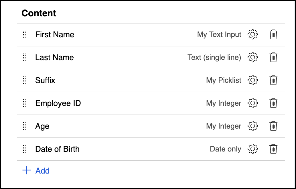
The following example code shows the configuration of the
CONTENTPICKER format in the component definition
file:
{
      "name": "Fields",
      "label": "Fields",
      "format": "CONTENTPICKER",
      "itemTypes": ["Fields"],
      "allowCreatingGroup": true
}
The following list shows additional attributes that are specific to this format:
allowCreatingGroup- A Boolean value that determines whether to create groups in the view
metadata with the
CONTENTPICKER. Defaults totrue, if not specified. itemTypes- An array that specifies the type of elements in the region list. The
default value is
["Fields", "Views"]. You can also useWidgetsandInsights. This attribute is a renamed version ofaddTypeList.
You can configure the content picker to use the relevant record structure that the
system returns when you edit a View. You can also configure the
content picker to retrieve addable items from a data page list. If you do that,
include a source attribute and set the
saveToConfig attribute to true, as shown in
the following example:
{
  format: "CONTENTPICKER",
  name: "sourceList",
  label: "Objects",
  saveToConfig: true,
  source: {
    name: "D_ObjectsToExploreList",
    parameters: {
      "pyObjectType": "Data",
    },
    displayProp: "pyCaseName",
    valueProp: "pyID",
  }
}
Parameters for the data page list are optional. The system saves the data to a
view record in the config section as an array
of values that are based on the valueProp setting.
Group
Groups together fields or elements and presents the grouped fields as a single set.
Use the GROUP format to collect similar controls together. The
following figure shows an example of the GROUP format:
GROUP format property pane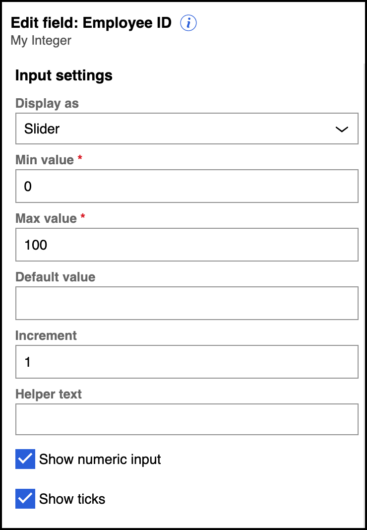
The following example code shows the configuration of the GROUP
format in the component definition file:
{
   "label": "Input settings",
   "format": "GROUP",
   "visibility": "(!readOnly = true)",
   "properties": [
    {
       "name": "displayAs",
       "label": "Display as",
       …
       …
    },
    {
       "name": "min",
       "label": "Min value",
       …
       …
    },
    {
       "name": "max",
       "label": "Max value",
       …
       …
    },
    {
       "name": "defaultValue",
       "label": "Default value",
       …
       …
    },
    {
       "name": "step",
       "label": "Increment",
       …
       …
    },
    {
       "name": "helperText",
       "label": "Helper text",
       …
       …
    },
    {
       "name": "showInput",
       "label": "Show numeric input",
       …
       …
    },
    {
       "name": "showTicks",
       "label": "Show ticks",
       …
       …
     }
  ]
}collapsible- Determines whether to display the grouped fields as a collapsible item.
The default value is
false.
Inline
Displays text in line with a field value, as shown in the following figure:
INLINE format property pane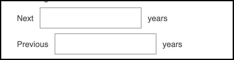
The following example code shows the configuration of the INLINE
format in the component definition file:
{
  format: 'INLINE',
  elements: [
    {
      key: 'next',
      format: 'LABEL',
      label: 'Next',
      variant: 'secondary'
    },
    {
      key: 'nextYear',
      format: 'TEXT',
      name: 'nextYears',
      label: 'Next Year',
      required: false
    },
    {
      key: 'year',
      format: 'LABEL',
      label: 'Years',
      variant: 'secondary'
    }
  ]
}
The following list shows the additional attributes that are specific to this format:
elements- Array elements to display inline with the text.
elements.variant- Determines how the element is displayed. Use this attribute in elements
where you want to display the field label in a different style than the
default text. Allowed values are
primary,secondary,h1,h2,h3,h4,h5, andh6.
Label
Determines the display format for a field label, as shown in the following figure:
LABEL format property pane
The following example code shows the configuration of the LABEL
format in the component definition file:
{
  "format": "LABEL",
  "label": "Year range",
  "variant": "secondary"
}
The following figure and code snippet of the LABEL format with the
h1variant value:
LABEL format property pane with h1 style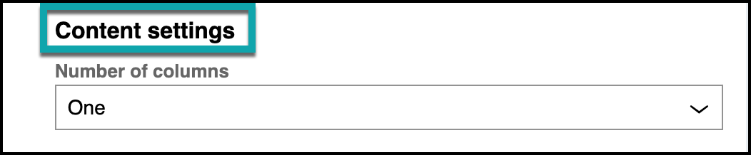
{
  "format": "LABEL",
  "label": "Content settings",
  "name": "Content settings",
  "variant": "h2"
}variant- Determines how the element is displayed. Use this attribute to display
the field label in a different style than the default text. Allowed
values are
primary,secondary,h1,h2,h3,h4,h5, andh6.
Number
Presents the user with a text box in which they can input numbers, as shown in the following figure:
The following example code shows the configuration of the NUMBER
format in the component definition file:
{
      "name": "min",
      "label": "Min value",
      "format": "NUMBER",
      "defaultValue": "0",
      "required": true,
      "visibility": "($this.displayAs = slider)"
}
The following list shows additional attributes that are specific to this format:
min- The minimum value that the system allows in the input. The default is 0.
max- The maximum value that the system allows in the input.
numberOfDecimals- The maximum number of decimal places. The system rounds the value to the number of places.
showDecimal- BOOLEAN value to determine whether to show decimal places. The system
rounds the values if this attribute is set to
true.
Property
Presents the user with a combo box to select a field record from the data model of the case type, as shown in the following figure. The properties that the system retrieves are based on the class of the view.
PROPERTY format property pane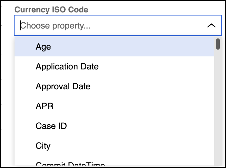
The following example code shows the configuration of the PROPERTY
format in the component definition file:
{
       "key": "currencyISOCode",
        "format": "PROPERTY",
        "name": "currencyISOCode",
        "label": "Currency ISO Code",
        "match": "propertyRef"
}
Select
Presents the user with a drop-down list, as shown in the following figure. You can generate the list options based on a data page, or use hard-coded data.
SELECT format property pane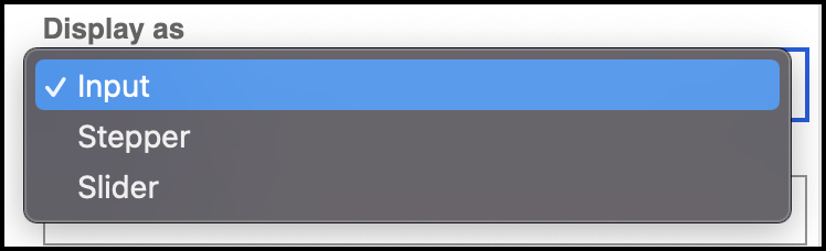
The following example code shows the configuration of the SELECT
format in the component definition file:
{
  "name": "displayAs",
  "label": "Display as",
  "format": "SELECT",
  "defaultValue": "input",
  "source": [
    {
       "key": "input",
       "value": "Input"
    },
    {
       "key": "stepper",
       "value": "Stepper"
    },
    {
       "key": "slider",
       "value": "Slider"
    }
  ]
}
The following list shows additional attributes specific to this implementation of the
SELECT format:
defaultValue- Determines the default option from the list to display.
placeholder- Determines the informational text to display in the field.
source- An array of key-value pairs for the list.
The following example code shows the implementation of the SELECT format with options loaded from a data page:
{
  format: "SELECT",
  name: "displayAs",
  label: "Display as",
  source: {
    name: "D_listOfInputs",
    parameters: {
      DataPageParam1: "hardcodedparamvalue",
      DataPageParam2: "$this.id", // uses value of `id` attribute in the metadata config
    },
    displayProp: "pyLabel", // default is "label"
    valueProp: "pyValue", // default is "name"
  }
} {
name: 'displayfield',
format: 'SELECT',
label: 'Display field',
visibility: "$this.displayAs != 'table' && $this.mode != 'readonly'",
source: {
filter:
'$this.isSystemField IS_NULL && $this.typeKey STARTS_WITH "Test-Fields-Scalar" && $this.typeKey NOT_CONTAINS ":"',
},
} The following list shows additional attributes specific to this implementation of the
SELECT format:
defaultValue- Determines the default option from the list to display.
placeholder- Determines the informational text to display in the field.
source- An object to configure the source of the options. Defaults to use the field records from the view context class, if not specified.
source.displayProp- Determines the item in the source to use as the label. Defaults to
label, if not specified. source.filter- The expression for filtering records from the specified source.
source.name- The name of the data page to call. Defaults to use the field records from the view context class, if not specified.
source.parameters- An object from the data page parameters.
source.valueProp- Determines the item in the source to use as the value. Defaults to
value, if not specified.
Text
Presents the user with a text input, as shown in the following figure:
TEXT format property pane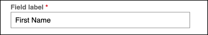
The following example code shows the configuration of the TEXT
format in the component definition file:
{
      "name": "label",
      "label": "Field label",
      "format": "TEXT",
      "ignorePattern": '[0-9]',
      "required": true
}
The following list shows the additional attributes that are specific to this format:
ignorePattern- Sets a regex pattern of characters to ignore in the field input. In the example code, this attribute is configured to ignore numbers.
includeAnnotations- A Boolean value that determines whether to include annotations in the
view meta data. Defaults to
true, if not specified.
Viewpicker
Presents the user with a combo box to select a view record, as shown in the following figure:
VIEWPICKER format property pane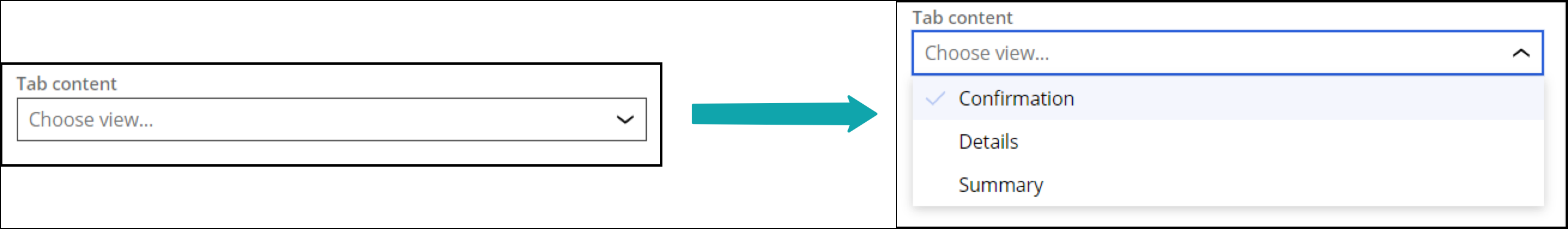
The following example code shows the configuration of the VIEWPICKER
format in the component definition file:
{
  format: "VIEWPICKER",
  name: "tabContent",
  label: "Tab content",
}
Condition-based properties
Condition-based properties are applicable in all formats. They present the user with a drop-down menu of hard-coded options. Available condition properties are:
DISABLEDREADONLYREQUIREDVISIBILITY
The following figure shows an example of the condition-based properties:
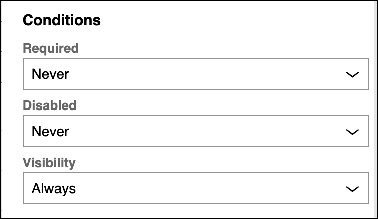
The following list shows an example figure and configuration of the properties in the component definition file:
- DISABLED
DISABLEDformat property pane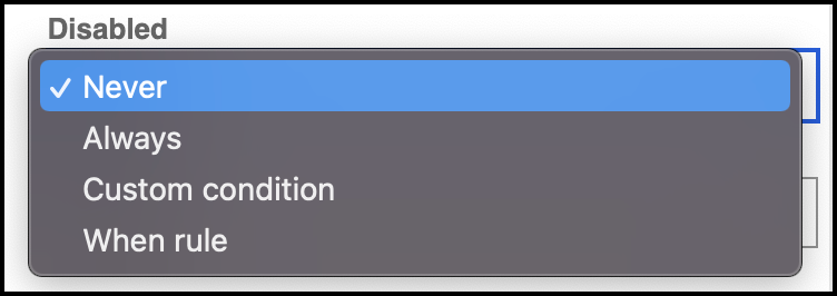
{ format: "DISABLED", name: "disabled", label: "Disabled", visibility: "(!$this.readOnly = true)" } - READONLY
READONLYformat property pane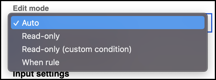
{ format: "READONLY", name: "readOnly", label: "Edit mode" } - REQUIRED
REQUIREDformat property pane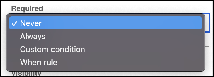
{ format: "REQUIRED", name: "required", label: "Required", visibility: "(!$this.readOnly = true)" } - VISIBILITY
VISIBILITYformat property pane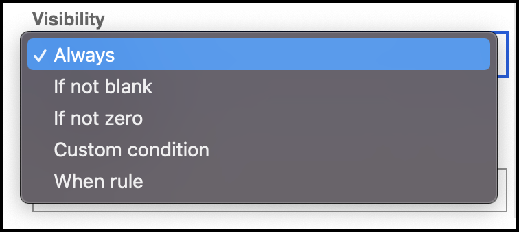
{
  format: "VISIBILITY",
  name: "visibility",
  label: "Visibility"
}
Previous topic Properties Next topic Annotations