Skin form — Components tab — Layouts — Tabs
Styles set here apply to tabs. When you create a tab group in a layout, you can select a format in the Style format field in the Tab Group properties panel. Tabs in a harness container always use the Standard format.
You can specify values for text, border, background, height, and indentation of the following tab formats:
- Standard — default format applied to all tab groups (tabs in a harness container, tabs in a section)
- Sub — sub-tab format
- Repeating — tabbed repeat layouts
You can also create custom tab formats and add them to tab groups within sections. Custom formats are not applicable to tabs in a harness container. Tabs in a harness container always use the Standard format.
A preview of the currently selected format displays to the right. You can also preview formats by clicking the Run icon in the toolbar and selecting one of the following preview options: Run Process, Open Portal, Harness Preview, UI Gallery Preview, Skin Preview. In the Skin Preview, click Tabs.
Use the same formatting
| Use the same formatting for Active and Inactive headers |
Applies the same settings to active and inactive tab headers.
Clear this check box to define different styles for active and inactive tabs. Additional fields appear. |
Text
Applies to the text of tab headers. If you cleared the Use the same formatting for Active and Inactive headers check box, define styles for Active Text and Inactive Text.
| Use mixin |
|
| Specify styles |
Select this check box to define a custom text format:
|
Border
Applies to the border of tab headers. If you cleared the Use the same formatting for Active and Inactive headers check box, define styles for Active Border and Inactive Border.
| Use mixin | If desired, you can specify the Top , Left , Right , or Bottom border as none, solid, dashed, or dotted, rather than inheriting the style from the selected mixin. |
| Specify styles | You can specify a custom border by selecting or clearing the Apply to all sides check box:
The following border styles are available:
|
Background
Applies to the background of tab headers. If you cleared the Use the same formatting for Active and Inactive headers check box, define styles for Active Background and Inactive Background.
| Use mixin | |
| Specify styles |
Select this check box to define a custom background:
Select the background Type:
|
Height
| Height | Specify the height of the tab by entering a value in pixels. This height applies to all tab positions and orientations. |
Indent
| Indent | For formats other than Standard , specify the tab indent. |
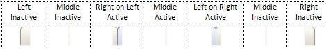
About rendering ten-part background images
Each tab that uses a ten-part background image is comprised of a left, middle, and right image. Variations of these images are used to differentiate a tab that is selected (active) or not selected (inactive). Expanding the width beyond the width of the image creates a space between it and the adjoining image. Reducing the pixel size cuts off the image at run time.
By default, the middle images (active or inactive) are tiled across the tabbed header and automatically sized to span the left and right images to equal a total width of 110 pixels. Use the Auto setting so that the width expands as text is entered in the tab.
Combinations of the tab images comprise a tab rendering based upon the position and focus of the tab. The three positions are:
- The left-most tab in the array.
- The middle tab between the left-most and right-most tabs.
- The right-most tab in the array.
The examples below show the settings used for each tab position and its focus:
Left-most tab active

Middle tab active
Right-most tab active

To achieve an overlap effect, use an overlap image in the Left on Right Collapse and Right on Left. You can use the Image Library to search for standard overlap images (for instance, search on the word "overlap". Here is an example of a Left on Right Collapse overlap:

About rendering dual background images
Each tab that uses a dual background image is comprised of a Fixed (Left) and Stretched
(Right) image. They display the active and inactive states in the same image and must be the
same height. The Stretched (Right) image must be as wide as any text you enter into the
tabs. Use the
Auto
setting to allow the width to expand with the text
entered.
The Fixed (Left) and Stretched (Right) images should be from the same RuleSet and version.
The images you specify here apply to both Active and Inactive tabbed headers.

- Create a custom tab format
You can create custom tab formats that you can apply to tab groups within sections.
- Applying a custom tab format
- Section forms — Adding a Tab group
- Harness and section forms — Adding a Tabbed Repeat layout
- Component styles (custom style formats)
Use the Component styles tab to define the presentation of components by creating custom style formats. After you define style formats, reference them on property panes for sections, harnesses, and controls.
Previous topic Skin form — Components tab — Repeat-row/columns Next topic Creating a custom tab format