Improve chart presentation (8.2)
Adding a chart to a report harness or section in Dev Studio involves configuring the chart by selecting a chart type, defining the data source, and setting basic display properties, such as chart title and size. More display properties have been added to provide you with more control over the chart design, thereby enabling you to better meet business design needs and more effectively highlight important data.
You can now:
- Set visibility and color options for the X and Y axis
- Set visibility and design options for grid lines
- Define additional presentation options for grids and tooltips
- Apply color formatting by category for single series bar and column charts
- Control hover highlight behavior for data points and legends
The following figure illustrates charts with a hidden X and Y axis, dotted grid lines, and formatted tooltips.
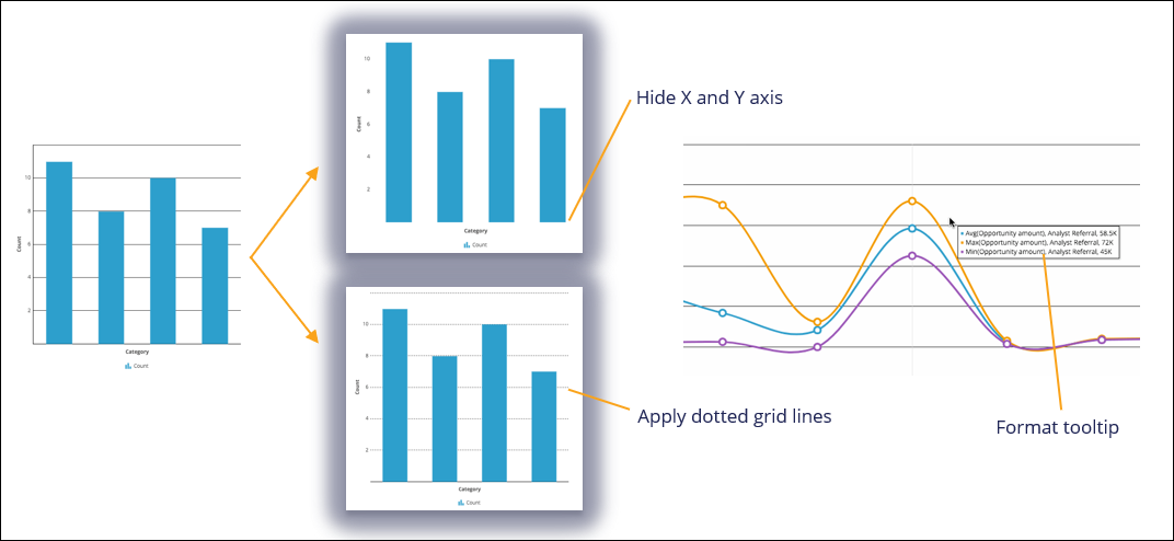
Improve chart presentation by setting presentation options for the X and Y axis, grid lines, and tooltips
The following figure illustrates charts with hover highlight behavior set and a border for data points applied.
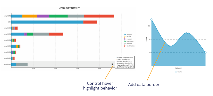
Improve chart presentation by controlling hover highlight behavior and formatting data presentation
For more information about configuring charts, see Harness and section forms - Adding a chart.
Previous topic Gain better data insight with new charts (8.2) Next topic Robotic Automation