Configuring a modal dialog box for a button
Divide your user interface into smaller, context-sensitive chunks that appear only when relevant. By pairing a modal dialog box to a button, you can hide optional forms until the users request them. For example, you can add a Review button that users can click to correct their address information when they finalize an online order.
- Open the view that you want to edit.For more information, see Accessing views in your application.
- In the configuration pane on the right side of the window, hover over the control, and then click the Edit icon.
- In the configuration pane, click Add action sets.
- Click Create an action set.
- In the Action set table, click .
- In the same row of the table, click .
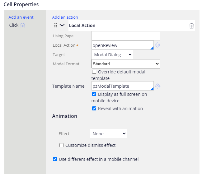
- In the Local action field, select the flow rule that opens the section that has the form fields.
- In the Target field, select Modal dialog.
- Optional: To run the flow in the context of an embedded section that uses a data page, in the Using page field, enter the name of the page or page list that you want to use.
- Optional: To specify a custom format of the modal dialog box that is defined in the skin, in the Modal format list, select Other, and then select the format that you want to use.
- Optional: To use the default modal dialog box template, clear the Override default modal template check box.
- In the Template name field, enter the name of the template that you want to use for the modal dialog box.
- Optional: To use an animation to open and close the modal dialog box, select the
Reveal with animation check box, and then specify the settings
for Effect, Speed and
Accel options.
- Click OK.
- In the configuration pane, click Apply.
Previous topic Modal dialog box Next topic Configuring a modal dialog box for a list-based layout

