Layouts
Layouts help you organize UI elements on the screen and determine the overall presentation of your portal.
You can use layouts within a harness or a section to define how your application, or a section in that application, looks in different contexts and on different devices.Layouts and templates
When you design your application using App Studio, you use design templates to organize the views in the user interface. Design templates rely on the design system to provide a low-code framework for your user interface, and Pega Platform offers many out-of-the-box templates for different application scenarios. For example, a Home UI template divides the screen into two columns that you can scroll independently.
You can build your own design templates and other custom UI elements by using layout types in Dev Studio. Custom layouts are rendered in HTML5 standard mode and are styled in the skin of the application, which helps you maintain a consistent UI theme. This solution offers more flexibility, but is also more difficult to maintain, and requires additional development effort during migration to Cosmos React UI.
Layout types
You can use the following layouts when you create the user interface for your application:
- Dynamic layout
- Arranges item and label placement and alignment depending on the type of screen, such as mobile, desktop, and laptop. You can define breakpoints for dynamic layouts that improve readability by determining the contents of screens on mobile devices.
- Column layout
- Displays main content next to supporting content in up to three columns. For example, you can have case data in the main column, and relevant attachments in a supporting column.
- Layout group
- Contains various layouts that optimize screen space by grouping related information. You can configure layout groups to appear as a set of tabs, a menu, or a stack after reaching a breakpoint. Layout groups are especially effective with large amounts of data.
- Dynamic layout group
- Creates repeating dynamic tabs which present information from a property or a data page. The dynamic layout group provides the same responsive behavior as the layout group component.
- Navigational tree layout
- Organizes data into expandable and collapsible branches to help you focus on relevant content. You can configure the branches to allow further actions, such as opening data objects in a branch.
- Repeating dynamic layout
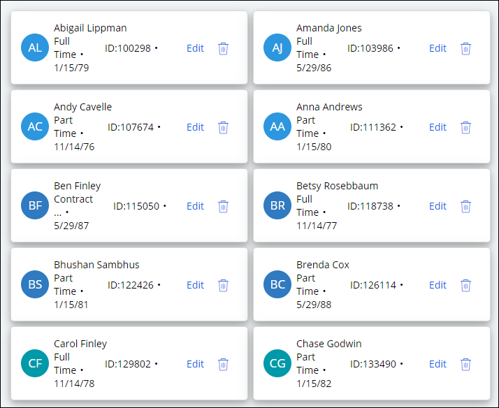
- Automates the display of repetitive data. For example, in a self-service portal, you can arrange items in a shopping cart into a list that contains information about each product, such as name, type, and price. Repeating dynamic layouts support sorting and progressive data display.
- Table layout
- Helps organize and compare data by column and row.
- Screen layout
- Determines the overall structure of a screen at a page level through the use of templates. Screen layouts support responsive display and can automatically adjust your interface to fit various mobile displays. These layouts also use semantic HTML tags to mark regions in the page and provide Accessible Rich Internet Applications (ARIA) roles by default. Unlike other layouts, you can use screen layouts only within a harness.

You can find more visual examples of layouts in the Gallery. For more information, see Accessing the UI Gallery.
- Best practices for layouts
Ensure that you build a well-structured and consistent UI by learning about best practices for using layouts as building blocks for your interface.
- Creating a dynamic layout
Reduce UI maintenance and development efforts by using dynamic layouts, which display content flexibly while separating content and presentation. When you add UI elements to a dynamic layout, the layout's format automates the alignment of fields and labels, and saves you manual work.
- Creating a column layout
Organize data in your UI with a column layout, which displays primary content, such as a work item, alongside related supporting content, such as an attachment. When you structure your content with a column layout, you enhance the readability and visual appeal of your application.
- Creating a navigational tree layout
Help your users navigate large numbers of nested entries by creating a navigational tree layout with expandable branches. Navigational tree layouts source data from a page list property, and reflect the structure of the source.
- Creating a repeating dynamic layout
Save development time by automating the display of repetitive data records with a Repeating dynamic layout.
- Layout Groups
Layout groups help you modularize closely related information and optimize the window area. By using conventional and dynamic layout groups, you can present the information that your users need in neat chunks, and create clearer user interface.
- Table layout
Tables are flexible user interface components that help you present large amounts of information in a clear and consistent way. Because you can quickly customize and expand tables, they provide a reliable basis for users to view or compare information.
- Creating a hierarchical table layout
Help users access and compare nested data with a Hierarchical table layout. Hierarchical table layouts support expandable rows, which can provide you with a more compact view of your data.
- Configuring a screen layout
Determine the purpose of each area of the screen layout and identify the section to be placed in each area. When you create a new harness, the application populates it with a default screen layout, which you can reorganize conveniently by using one of the out-of-the-box templates.
- Managing field validation in hidden sections
Define whether your users receive a warning when they leave a hidden required field empty. For example, if you use tabs, you might want to display validation errors for empty fields that are not currently active.
- Configuration options for layouts
Learn about the layout configuration options that you can use to customize your layout. For example, you can specify the format, the visibility of the layout, and the source of data for dynamic layouts.
Previous topic Advanced options for a harness Next topic Best practices for layouts
