Best practices for using helper text
While labels organize content and identify a control or a field, helper text is useful when users might need additional instructions to complete a task. Pega Platform provides several out-of-the-box options for adding text to your application with varying degrees of accessibility.
Learn more about the best practices for using helper text to build a UI that serves all users, including users who rely on assistive technologies.| Name | Description | Benefits | Drawbacks | Keyboard support | Screen reader support | Recommended |
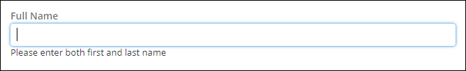
| In-line | The text is displayed directly below the control. For more information, see Adding text to controls. |
| In-line helper text across multiple controls might introduce clutter. | Yes | Yes | Yes |
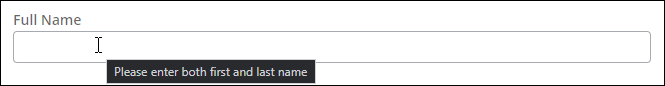
| Smart tip | A bubble of text is displayed directly above or below the
field. You can configure a smart tip by creating an action set. For more information, see Adding action sets to a control and Available UI actions. |
| Smart tips produce an ARIA label on the field, overriding the label for screen reader users. | Yes | Yes | Yes |
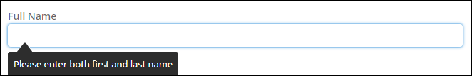
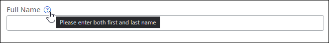
| Tooltip | Helper text is displayed when the user hovers on the field.
Tooltips use the |
| No | Yes | No | |
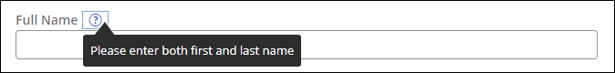
| Help icon with overlay on hover | A help icon is displayed next to the label of the control.
The icon is not a focusable element. For more information, see Adding text to controls. | No keyboard support. | No | Yes | No |
Previous topic Best practices for configuring UI components Next topic Inspecting accessibility