Cosmos taxonomy
The Cosmos design system maximizes productivity for the core guided workflow constructs of the Pega Platform. By utilizing Cosmos' extensive library of ready-to-use page structures, interaction patterns and UI components, you can deliver excellent interfaces while focusing on critical business logic and data, rather than building a UI from the ground up.
The key components of a Cosmos UI include the home page, landing pages, and the full case page. You can configure each of these components in the low-code authoring environment of App Studio.
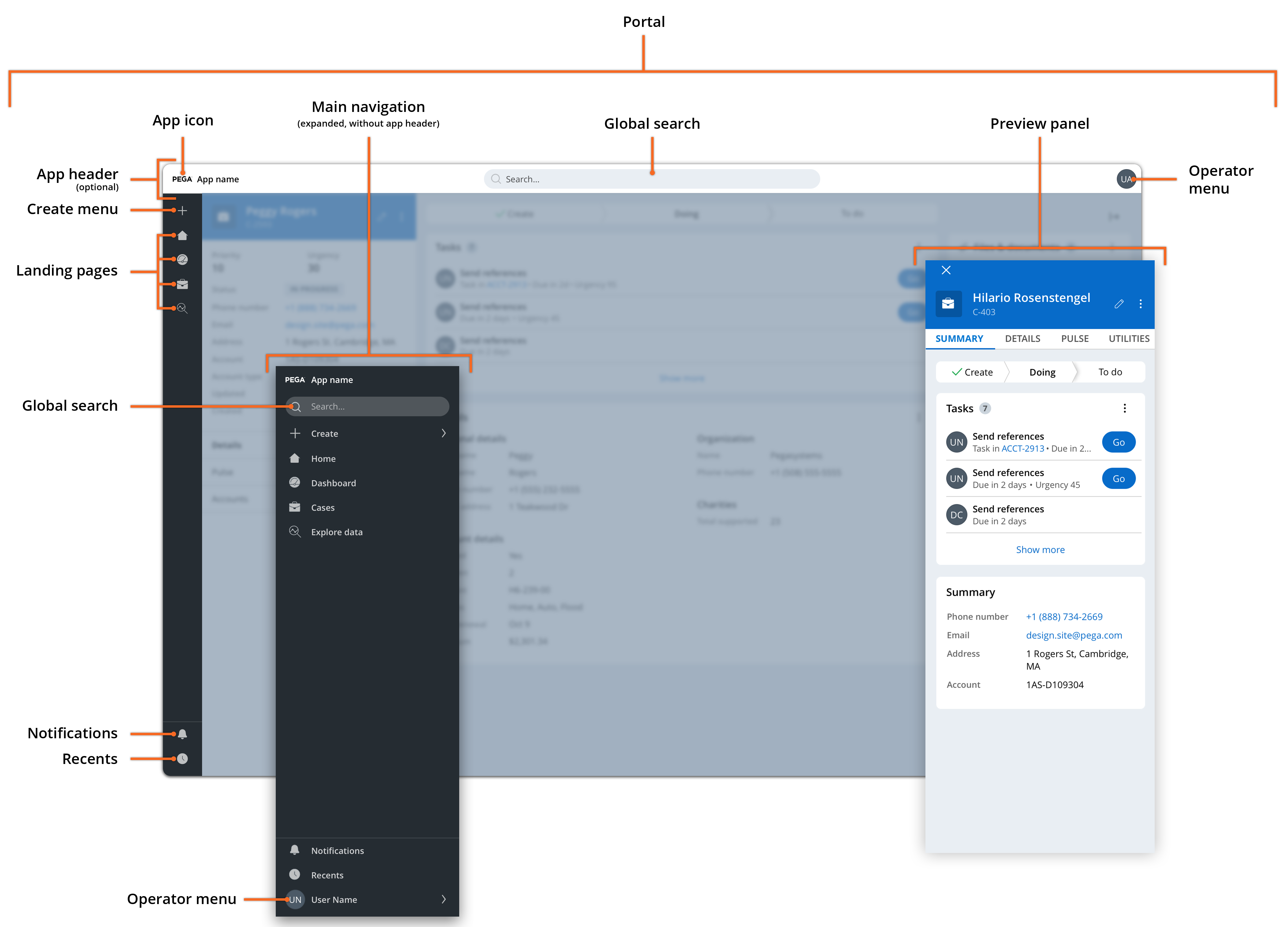
Cosmos portal

- Portal
- Helps you to define how people interact with your application. Portals represent the main interface of your application, and provide case workers, managers, and other users with the tools that they need to do their work.
- The application displays landing pages and case pages in the main area of the portal. The left side of the portal features an expandable menu that helps the users navigate the application and access notifications and recently viewed items. Depending on your business needs, the portal can also include either a full application header, or a compact header in the main menu consisting of an application name and logo. For more information, see Organizing the contents of a portal.
- Application header
- If space is not a priority, you can add a header to the Cosmos portal. Although global search is available away from the header in the main navigation, the application header can help your users identify the application at a glance, and provides a central location for search. The header includes an application icon, a search bar, and an operator menu icon. For more information, see Defining a portal header.
- Main navigation
- Helps users navigate to landing pages, create new cases and – if the application has no header – access search features. The menu also holds notifications and recent events, as well as user settings in portals in compact mode. If your application does not use a header, the main menu also includes a global search box. For more information, see Organizing the main navigation for a portal.
- Preview panel
- Provides users with tools to engage with a business object without context switching. The preview panel reuses the structure and style of the summary panel of the full case page. For more information, see Adding tabs to the summary panel.
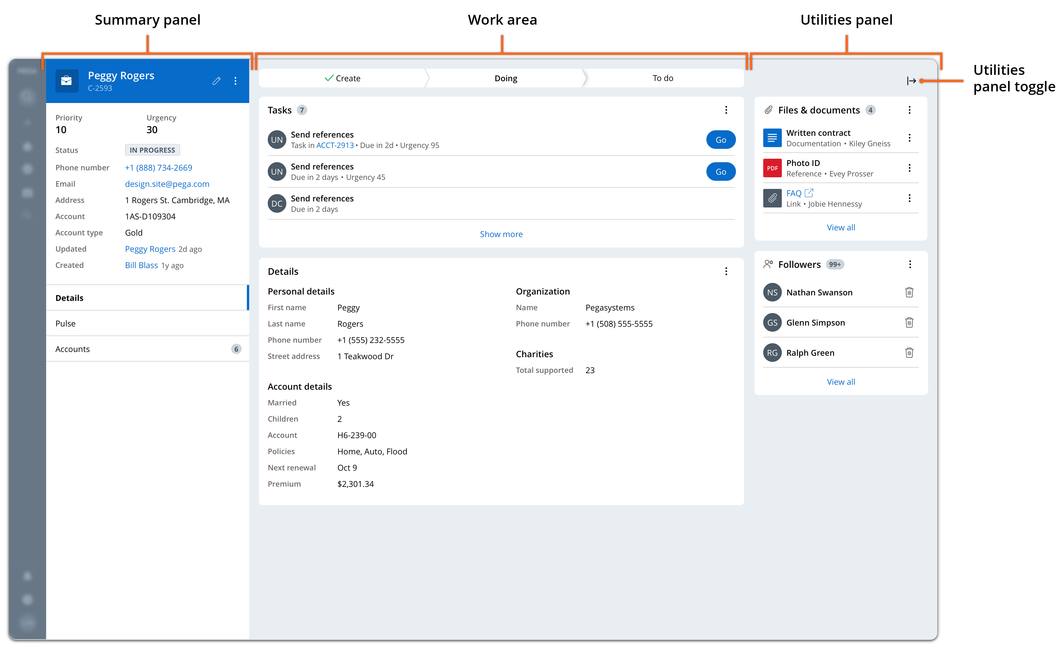
Cosmos full case page

- Work area
- Defines the space where users process their cases and access the bulk of case information. For more information, see Working with App Studio forms.
- Summary panel
- Displays the critical data of the case. The structure and style of the summary panel is the same as in the preview panel and the mobile full case page. For more information, see Customizing the case details section.
- Utilities panel
- Holds widgets and utilities that help users work a case, such as lists of attachments, case followers, or tags. For more information, see Widgets in Cosmos React.
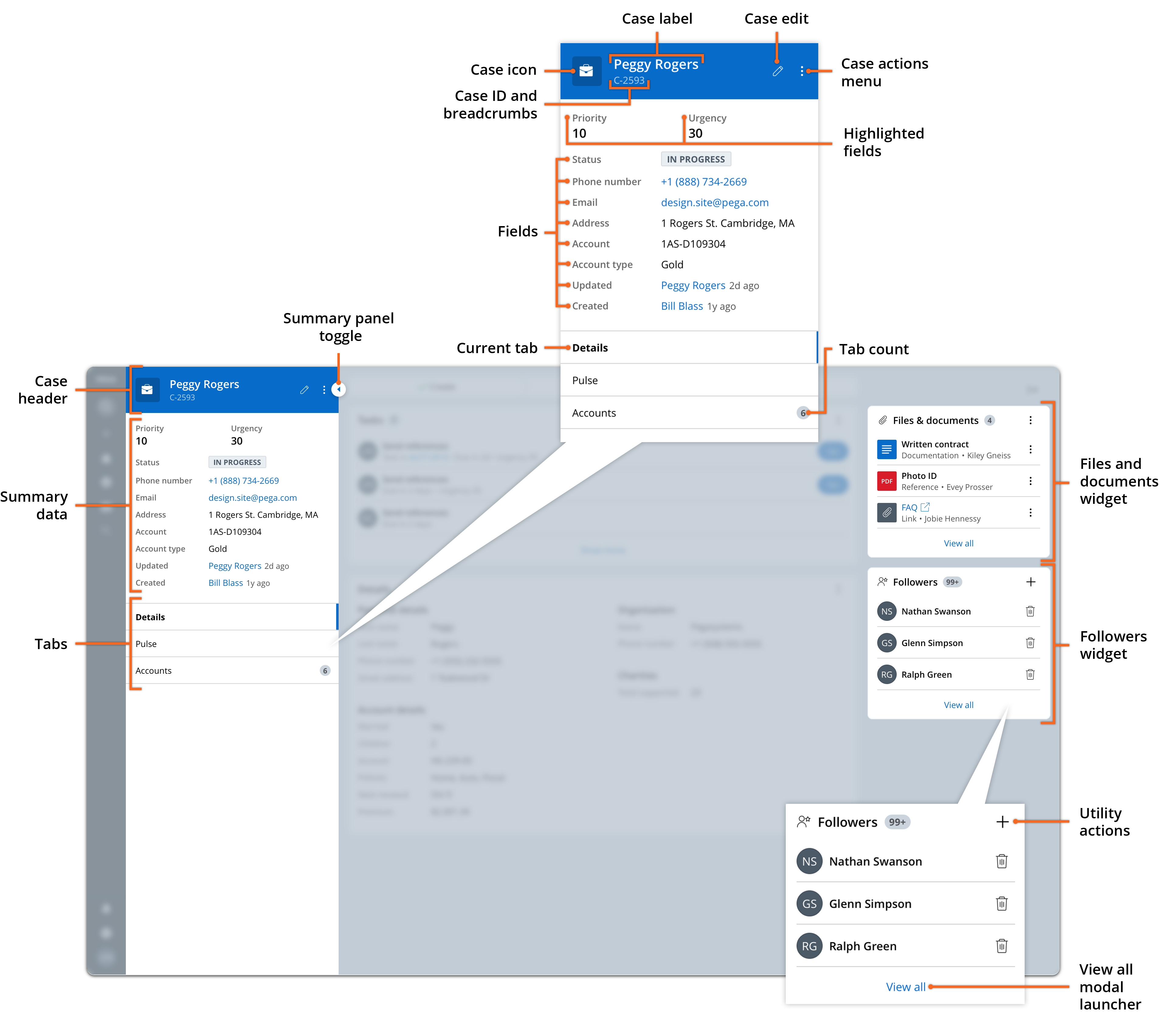
Summary panel

- Case header
- Holds the case name, icon, and number, as well as the case edit menu and the case actions menu. For more information, see Configuring general case type settings and Configuring and working with optional actions in case types.
- Summary data
- Displays highlighted primary and secondary fields for your case. For more information, see Customizing the case details section.
- Tabs
- Provide users with access to additional data. The application displays the content of the current tab in the bottom half of the work area. For more information, see Adding tabs to the summary panel.
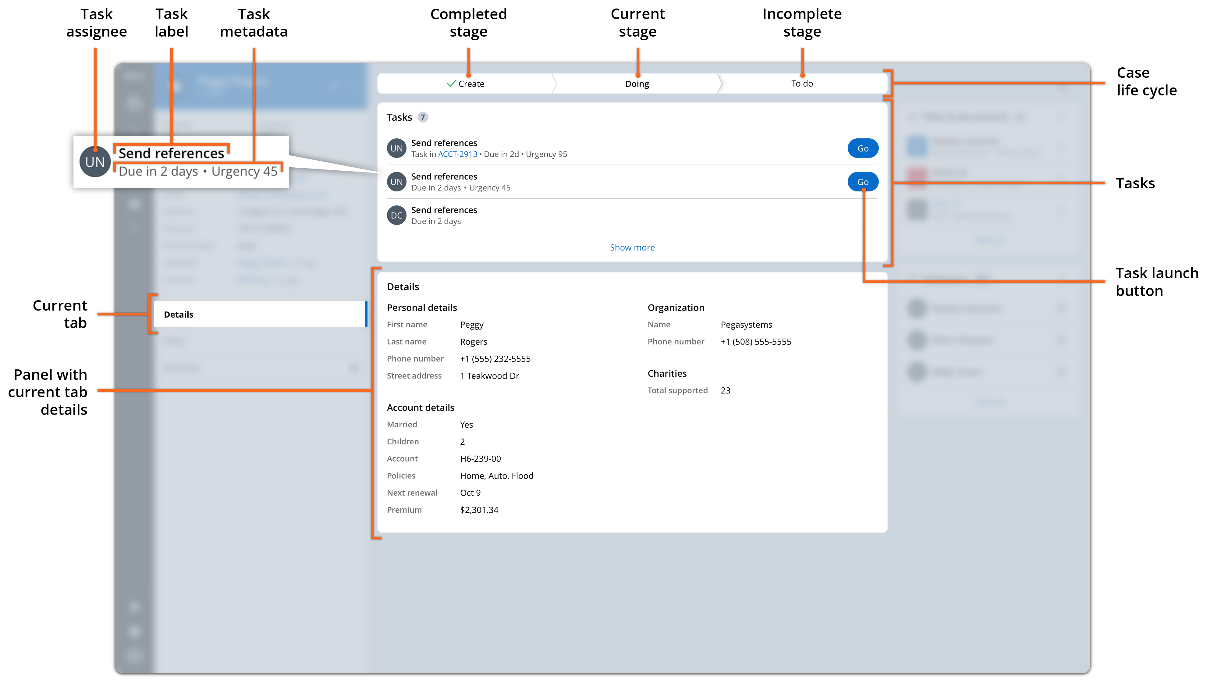
Cosmos work area

- Case life cycle
- Displays the stages and steps of your case and indicates the current stage. The case life cycle chevron display is optional, and you can remove it in the full view configuration.
- Tasks
- Enables users to navigate to and launch tasks in the case.
- Displayed tab content
- Shows the contents of the current tab selected in the summary panel.
Previous topic Theme Cosmos Next topic Learning about core user interface principles
