Prediction analysis charts
Learn how to understand the charts on the Analysis tab of a prediction. Monitoring predictions is a source of valuable information about the performance of your models.
Use these insights to identify and resolve issues related to performance, model output, and model input (predictors). Find out how you can improve your prediction to get more accurate results.
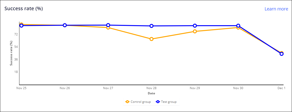
Success rate (%)
Success rate is the ratio of the number of times a proposition had a successful outcome (clicked, accepted, converted, and so on) to the number of times it was impressed or offered. The success rate is calculated by dividing the number of positive responses by the total responses received.
- This metric is good when
- It is gradually trending upwards or is stable.
- This metric needs attention when
- There is a downward trend in the success rate. The success rate may trend
down in the following situations:
- A lot of offers are being rejected which indicates a problem with the underlying models
- Response timeout is enabled, but explicit responses are not coming in within the timeout period, which leads to implicit negative responses.
Lift (%)
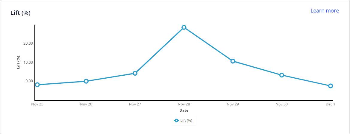
Lift is the relative difference in success rates between two groups, for example, test and control groups. It is a measure of how much better model-driven prioritization is in comparison to random prioritization. Predictions use a control group and provide random propensities to the subjects in that group.
- This metric is good when
- It is gradually trending upwards or is stable.
- This metric needs attention when
- There is a downward trend over time. The lift may trend down in the
following situations:
- A lot of offers are being rejected, which has decreased the success rate for the test group, which also indicates a problem with the underlying models.
- The control group is not representative enough of the actual population of the subjects or customers.
Performance (AUC)
AUC (Area Under Curve) is a measure of the accuracy of a model in predicting the outcome, which ranges from 50 to 100. A high AUC means that the model is good at predicting the outcome, while low AUC means that the model is not good at predicting the outcome.
- This metric is good when
- The trend is stable over time or gradually trending up.
- This metric needs attention when
- It is trending down, as this might indicate issues with the models. The AUC
can be low in the following situations:
- The outcome-based model has not received enough responses with positive outcomes.
- The model does not have the right set of predictors.
- The actions available to the model are too restrictive.
Performance (AUC) 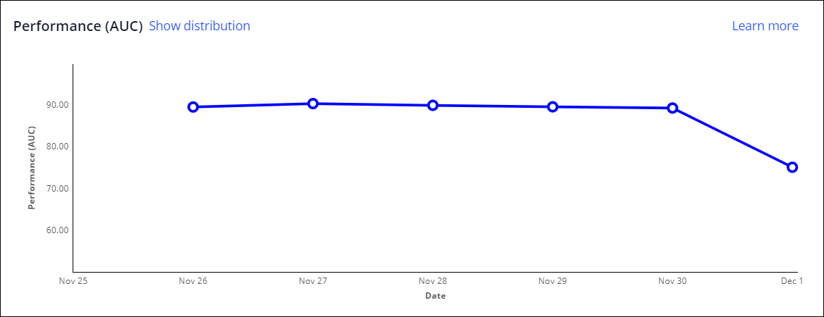
In a model update scenario, in which a shadow model runs alongside an active model, the performance chart displays the performance curves for each model in the active-shadow pair. The comparison can help you determine which model is more effective and decide whether you want to promote the shadow model to the active model position. The analysis is available for both outcome-based and supporting models.
The following figure shows the performance chart for the active model, Predict Churn DRF. This model is paired with a shadow model, Churn GBM. The chart shows two distinct lines that illustrate the performance of each model over time. Hover over the lines with your mouse pointer to see the exact scores for each model at different times. In this example, the two lines converge around January 27, suggesting that the models performed equally well. The detailed information that is displayed in the tooltip shows that the active model has a slightly higher score.
A model performance chart in a prediction 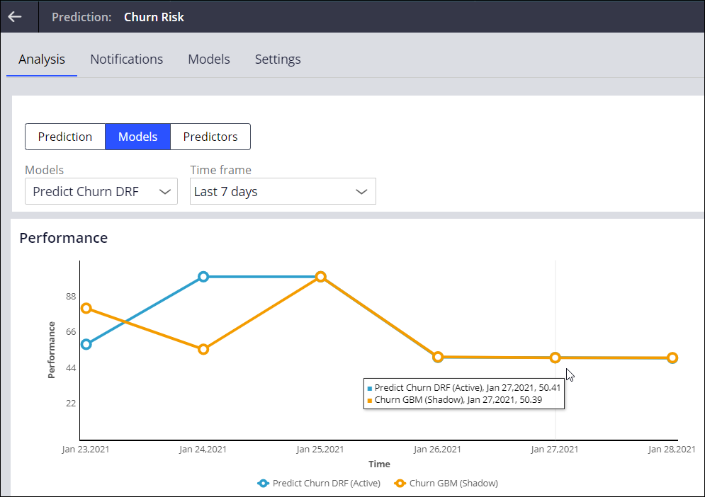
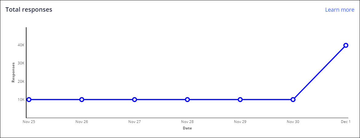
Total responses
The total responses are a measure of the number of responses that models receive, on which they base their output.
- This metric is good when
- The model is receiving responses for every day that the model is run.
- This metric needs attention when
- The responses received is 0 for a week or more in which the model is making
active decisions. The models could receive 0 responses in the following
situations:
- Limited actions or offers are introduced that are not receiving any responses.
- The response strategy is configured incorrectly and the Decision Architect needs to review it.
Propensity decile distribution
Propensity is a measure of the likelihood of a certain outcome and is expressed in a number from 0 to 1. For example, how likely it is that a customer accepts an offer.
- This metric is good when
- It shows a curve that peaks on the low end of the propensity range, with a long tail towards the higher propensities. A good propensity distribution shows a curve that peaks from the mid range (0.5) and gradually increases towards the higher propensity ranges, which means the model has received positive responses in the course of time.
- This metric needs attention when
- The propensity chart is not changing over time, if the propensity chart
shows a steady bar at mid range or the distribution is high around the
initial propensity ranges. This can happen in the following situations:
- The predictor configuration is wrong.
- The model is not learning from responses.
- The actions available to the model are too restrictive..
- The model was recently deployed and has not received responses yet. The propensity is smoothed by around 0.5, by adding more noise.
- Positive responses are declined in the course of time which could be
because of:
- Limited actions or offers are introduced.
- The predictor configuration is wrong.

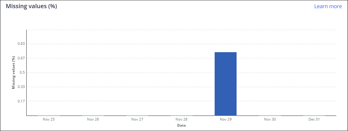
Missing values
Missing values of a predictor is the ratio of the number of times a predictor has missing values over the total number of times the predictor was used as part of a model's run, expressed as a percentage.
- This metric is good when
- The missing values bar is zero or close to zero.
- This metric needs attention when
- The percentage of missing values of a predictor is increasing over time.
Predictor values could be missing in the following situations:
- The mapping of predictors is incorrect.
- The Pega Platform property mapped to the predictor is not getting the value from an underlying source.
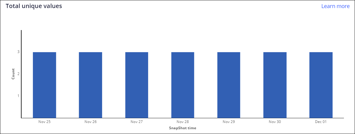
Total unique values
Total unique values is the count of the number of unique values encountered for a symbolic predictor in the period when the model was run.
- This metric is good when
- The count of unique values is consistent with the predictor data being provided to the model.
- This metric needs attention when
- The count of unique values is reduced to zero or decreases over time, or
there is a frequent fluctuation in the bars. This can happen in the
following situations:
- The symbolic predictor is not sourced properly from the corresponding data source.
- The configuration of predictors in the strategy is incorrect. When
parameterized predictors are used, ensure that the model is
receiving the inputs properly with the
Supply data via
model component. - There is a change in inflow of symbols for the predictor from the data source.
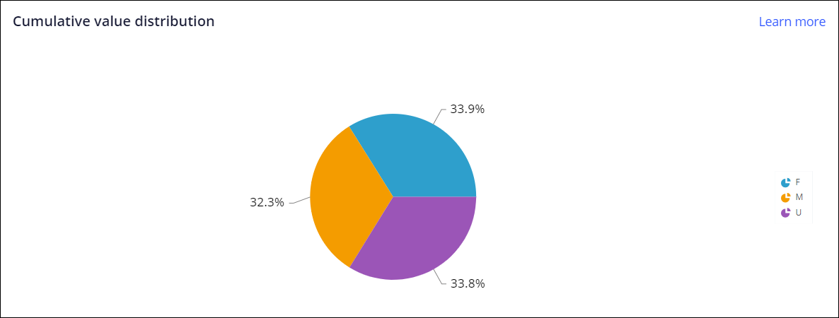
Cumulative value distribution
This chart shows the relative distribution of the most frequently encountered symbolic values (as percentages). Only the five most frequently occurring values are shown on the chart. The rest of the values are grouped into the Other category
- This metric needs attention when
- The proportion of values over the selected period does not match with the
expected distribution. If the proportions are different for one or more
predictors, it may indicate that:
- The predictor may be sourced incorrectly from the underlying Pega Platform data model.
- The mapping between the Pega Platform data model and the predictive or adaptive model may be incorrect.
Top values (%)
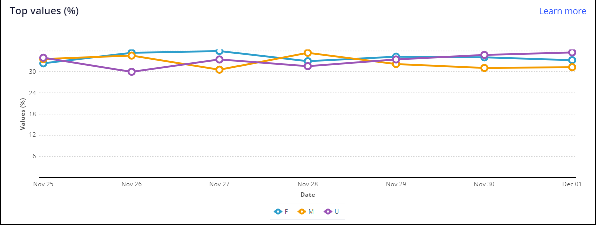
This chart shows the trend line of the most frequent values of a symbolic predictor over the selected time frame. View this chart in combination with the cumulative value distribution chart. Only the five most frequently occurring symbols from the cumulative distribution chart are shown in the top values chart. The rest of the symbols are grouped into the Other category.
- This metric is good when
- The chart is showing values that are consistent with the expected top values for this symbolic predictor. The distribution of the top values in this chart remains stable over the selected period.
- This metric needs attention when
- Any drastic change of the trend line, or points where it disappears, can
indicate an underlying change in the data. These drastic changes might occur
in the following situations:
- The actual predictor values have changed.
- Symbols appearing or disappearing over the selected time frame can indicate the addition or deletion of symbol levels that could affect model performance.
- The class property is not getting the correct values from the prediction strategy or model.
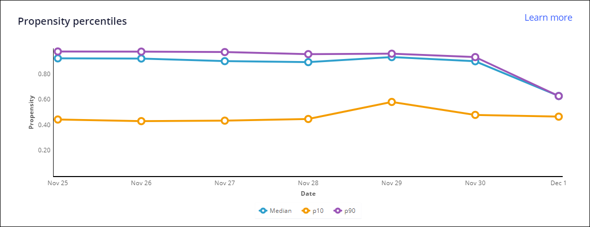
Propensity percentiles
The percentile values chart shows the 90th, 10th, and median percentile for prediction output. The p10 and p90 lines show the output for the lowest 10% and for the highest 90%.The percentile values represent the range of values for this numerical output.
- This metric is good when
- The lines on the chart do not show large fluctuations over time.
- This metric needs attention when
- There are large movements of the percentile values (upwards for 90th
percentile and downwards for the 10th percentile). Probable root causes
include:
- There has been data drift for the models.
- The model has received too many missing values, which has resulted in percentile drift.
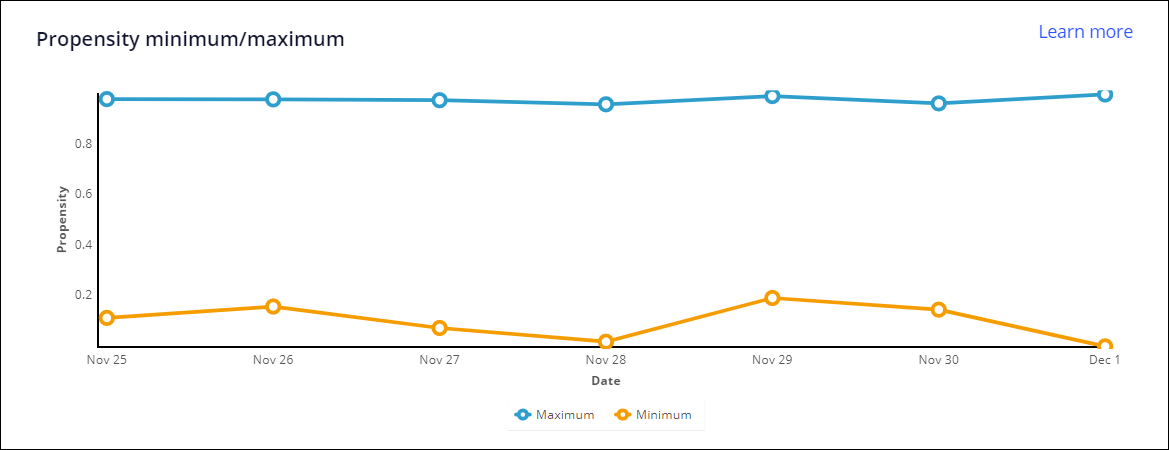
Propensity minimum/maximum
The propensity minimum, maximum chart shows the maximum and minimum percentile for prediction output. Combined with the charts of 10th, 90th, and median percentile values, these charts might indicate fluctuations in the values of the model outputs.
- This metric is good when
- The lines on the chart do not show large fluctuations over time.
- This metric needs attention when
- The lines show large movements of the percentiles values. Probable root
causes include:
- There has been data drift for the models.
- The model has received too many missing values, which has resulted in percentile drift.
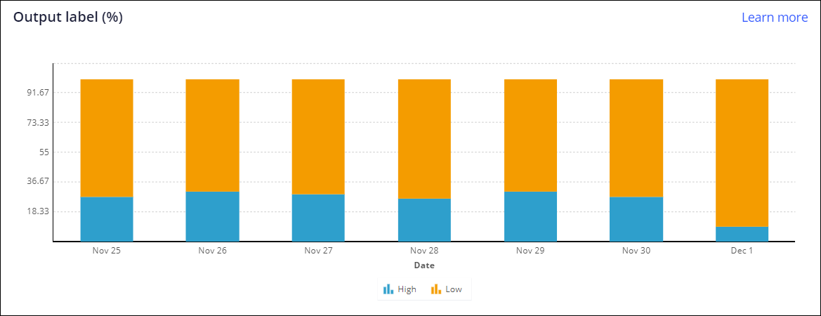
Output label (%)
The output label chart shows the distribution percentage of the model outputs for the selected time frame.
- This metric is good when
- The chart is showing an even distribution of model outputs for the time range.
- This metric needs attention when
- The segments are unevenly distributed for the time range. This can occur in
the following situations:
- Predictor mapping inside the model or strategy is incorrect.
- The predictor value is not available from the corresponding data sources or not mapped correctly to the Pega Platform property.
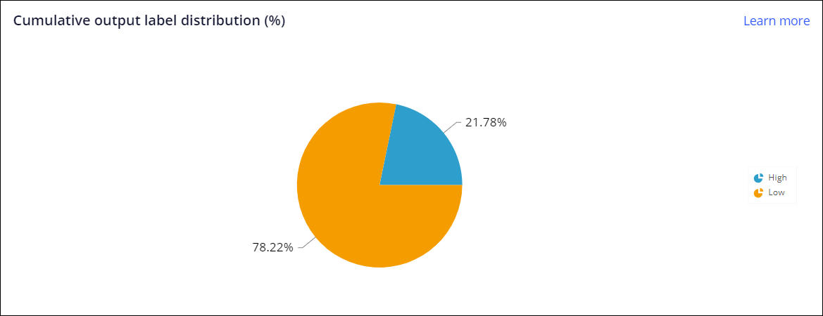
Cumulative output label distribution (%)
The cumulative output label distribution chart shows the cumulative distribution percentage of the model outputs for the selected time frame.
- This metric is good when
- The chart shows an even distribution of model outputs for the time frame.
- This metric needs attention when
- The pie charts are drastically uneven. This can occur in the following
situations:
- Predictor mapping inside the model or strategy is incorrect.
- The predictor value is not available from the corresponding data sources or not mapped correctly to the Pega Platform property.
Previous topic Monitoring predictions Next topic Updating active models in predictions with MLOps
